


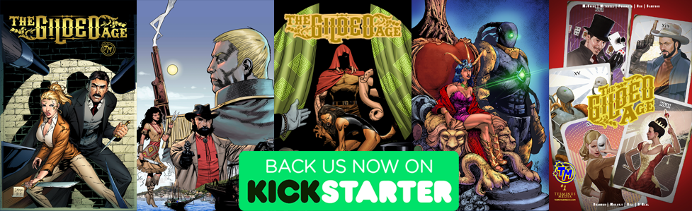
Check out John McGuire’s The Gilded Age steampunk graphic novel on Kickstarter!
Last week I started conversing with Nimesh about how he got his start in comics and got some insight on exactly how he sees his job of coloring in regards to telling a great story. This week we get into his work on The Gilded Age #3.
***
Do you have a favorite thing to color (genre, scenery, etc)? Least favorite?
I do believe my colors works very well with SciFi, but I personally prefer History periods like Medieval, Western, SteamPunk. But this genre is a bit tricky, so me coloring this, the editors need to want clean shiny colors over muted muddy colors. My least favorite, I think, is working on a book where you don’t have any chance to be creative, to work on a book where, let’s say everything is established and all you need to do is to copy what’s been done.
What’s the most challenging thing about being an artist in today’s world?
This one is a hard one. I do believe that today you can do whatever you want (well, in the past too, but now it’s more “easier”), so I will say the most challenging thing about being an artist in today’s world is Yourself. You are your own obstacle I guess.
If you could go back ten years, what advice might you have for your younger self? Something you wish you knew?
I think I needed to go a little more back and say “Internet”. In the future there will be this thing called Internet and provide everyone with more chances to do what they want.”
But if I had to go 10 years back I would say that the time I’m wasting learning 3D as a shortcut for not drawing is a complete waste of time. GO LEARN/IMPROVE ON DRAWING instead.
What is your worst habit?
Wondering off on social media. Dammit, that thing will get you!
Goals? One year from now? Five years from now?
My main goal is to make the Comic book industry my main profession. I’ve been working with Indies and I’ve been blessed with the money that it’s coming from this. Also I’ve been learning a lot. My goal for one year from now is to have a bigger client Rolodex that keeps me busy. And from 5 years from now I want to have worked for at least one book on Zenescope and Dynamite and I want to have clients enough to make me give up my regular job and just do comics.
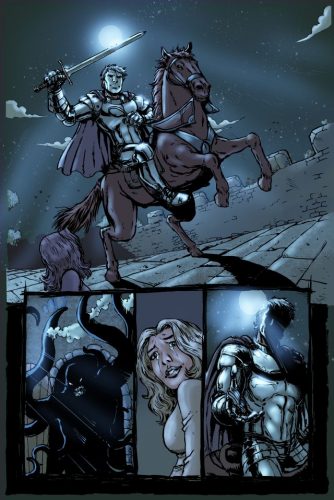
Gilded Age #3 Art – Antonio Brandao Colors – Nimesh Morarji
You did the coloring for The Gilded Age Issue 3 which has a dream sequence to start things off. It’s one of my favorite things in the issue, and I love how you really mixed in some of those darker greens and the red eyes following/chasing Hanna only to wash it away with the knight shows up. How did you land on that color scheme not only throughout that scene, but then contrast it against the rest of the issue.
I’m glad to hear that you like it, I also love that sequence and I do use that sequence as portfolio piece.
After reading the script and looking at the pages I noticed how this 3 pages contrast even artistically. For page one and 2 I wanted to showcase Hanna’s horror and the first thing that came to my mind was Nightmare on Elm Street. I went to see some scenes of the movie and I noticed that when Nancy (the girl from the movie) was dreaming and thus entering the Freddy realm things looked ugly, cold and disgusting. With the third page where the knight shows up I noticed that the artist made this shiny look to it and the first thing that came to my mind was a classical Disney Prince charming thing.
So I tried to translate this 2 feeling (the horror/disgust and the Prince that saves the day) in to colors. I believed the green on Hanna trying to escape would bring that disgust looking feel and it would contrast beautifully with the red glow of the monster while the next bright blue tints page would shine of readers face and evoke that prince charming saving her.
This was a unique scene on the book so I had to be very careful on my color choices because I couldn’t do it again in the book or the effect would be invalidated. So I’m extremely pleased to know that you felt that.
Did you have any favorite pieces within the issue you thought came together exactly the way you had envisioned?
Oh, yes, Page 5, Flashback scene. The muted colors worked very well in there in my opinion.
Also, page 10, that last panel, it’s so beautiful. The Artist drew it so well and with the colors laid down I do believe the reader feels Vanessa’s loneliness at that moment. It is a dramatic panel that I still today look at and feel the sadness.
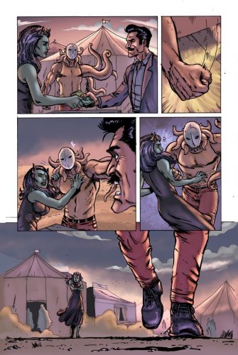
Gilded Age #3 Art – Antonio Brandao Colors – Nimesh Morarji
What are you currently working on?
I’m currently working on a Project for Wayward Raven Media called Balloon World and I already have lined up to start coloring O Lusitano the first Portuguese superhero and 2 more projects that I can’t name yet due to NDA’s.
Anything else that you’d like people to know about you (Hobbies? Passions? Favorite TV Show?)?
If you guys could check out the Western themed comics that I’m creating that would be awesome I guess.
😛
I´m making it available in WebComics format on nimprod.com and you can read it for free (shameless promotion, I know).
I’m currently spending all my free time on coloring comics and practicing drawing as I’m going to draw my comic later on too but sometimes I take a break and watch some movies, TV shows and read Comics. Westworld is definitely a must watch, are any of you watching it?
Where’s the best place to see your stuff on the web (website)?
Best place to see my stuff probably is my Facebook page https://www.facebook.com/nimeshmorarjiart/ where I post Works in Progress, process, and final pieces.
***
Nimesh also provided a little Bio:
My name is Nimesh.
I’m from Portugal and I’m a self-taught ComicBook Colorist. Currently I’m working in a freelance basis.
In my 3rd year coloring professionally, I’ve worked with publishers, such as Terminus Media, WayWard Raven, and Arcana. Titles that I’ve worked on includes: Carlton Harvey’s Soul of Suw, James B. Emmett’s The Committee, and Chuck Amadori’s Pale Dark.
With a background in illustration, I’m aware of how color can impact a story and my vision is to help creators bring dimension to their worlds.
***
I want to thank Nimesh for taking the time to answer my questions. And I definitely appreciate his contributions to helping bring The Gilded Age to life.
And make sure to check out his Western Comic at nimprod.com.
***
John McGuire is the author of the supernatural thriller The Dark That Follows, the steampunk comic The Gilded Age, and the novella There’s Something About Mac through the Amazon Kindle Worlds program.
His second novel, Hollow Empire, is now complete. The first episode is now FREE!
He also has a short story in the Beyond the Gate anthology, which is free on most platforms!
And has two shorts in the Machina Obscurum – A Collection of Small Shadows anthology! Check it out!
He can also be found at www.johnrmcguire.com.