This gallery contains 14 photos.
The ORIGINAL canvas art for J Edward’s most popular paintings are now available. The paintings are here. Interested buyers should reach… Read more


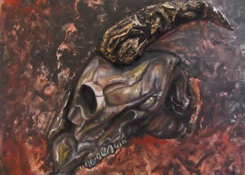
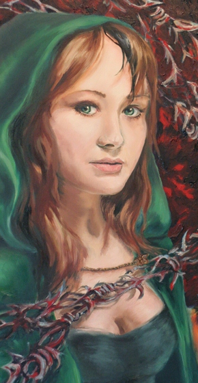
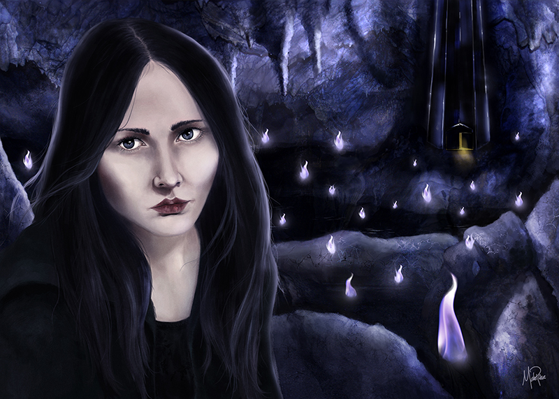
At DragonCon 2017, I wandered the art gallery for what seemed like eons.
I encountered stunning fantasy art of all kinds. I found light, darkness, and everything in-between.
But then I stumbled upon something I’d never really seen before. An artist – I admit I don’t know her name or website – had created a large quantity of long, narrow paintings on slender wooden panels.
For me, a guy who has always focused his work on canvasses, gesso boards, and plain old paper, the idea of painting on peculiar-sized chunks of wood transfixed me.
I knew at once I had to try a few of my own:
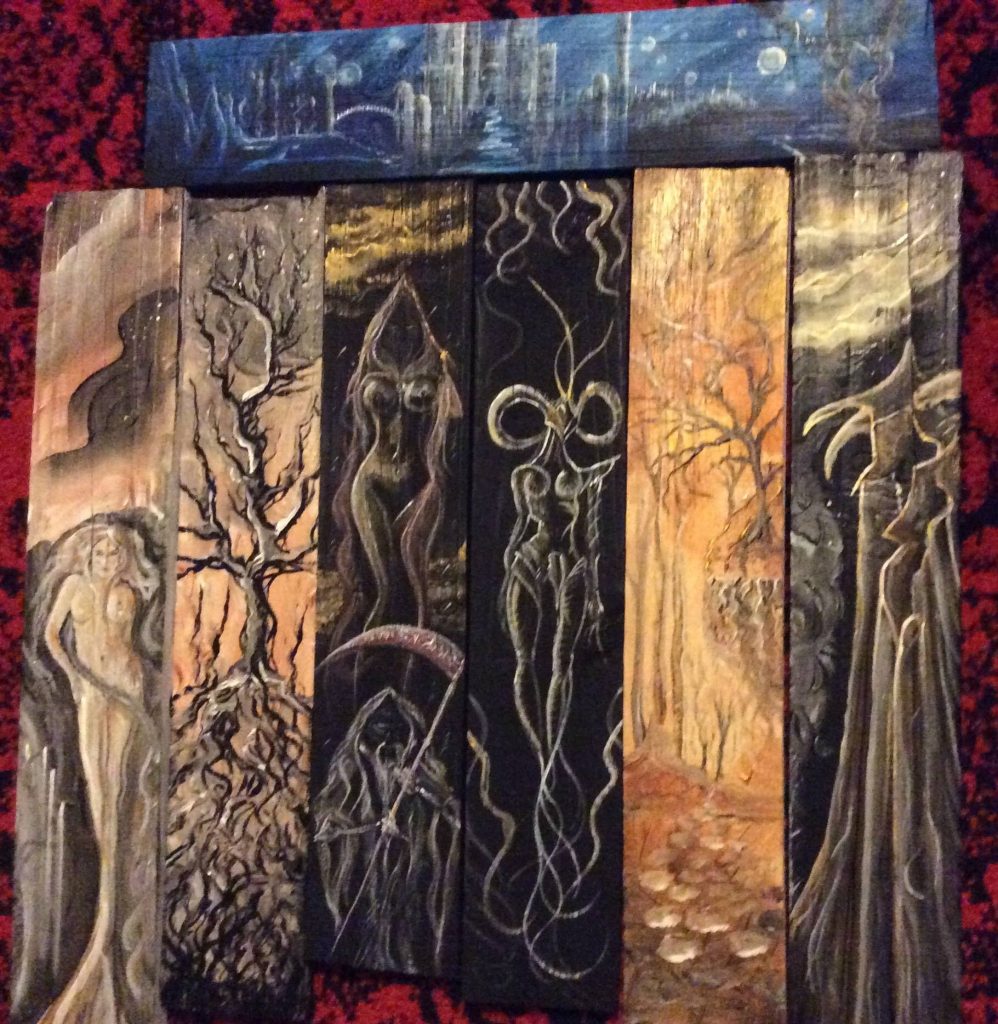
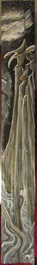
I started with these:

Pieces of an old picket fence. About 20″ long – 4″ wide. Cut, dried, and sanded to a smooth finish.
*
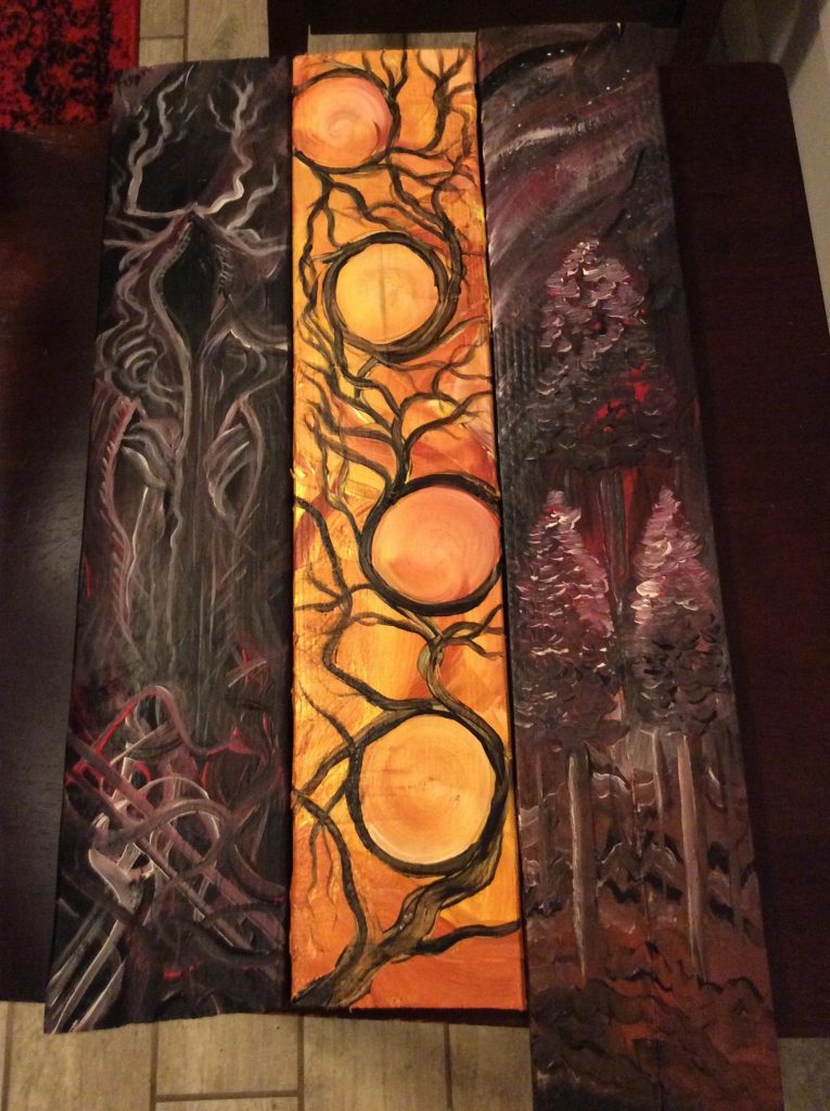
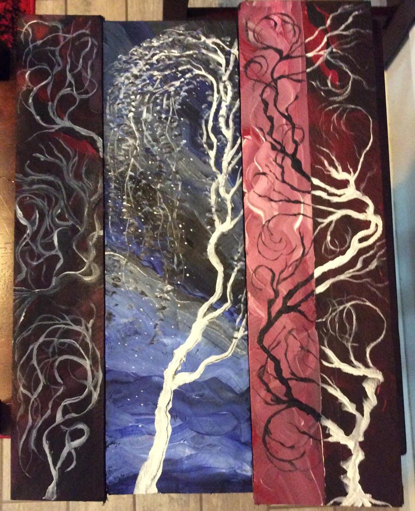
And I moved on to these:

 *
*
Here’s an up close shot of my favorite plank, The Sorcerer:
*
After finishing a ton of smaller planks, I tried a giant plank. This one’s 6′ tall and 12″ wide. It was a true pleasure to paint:
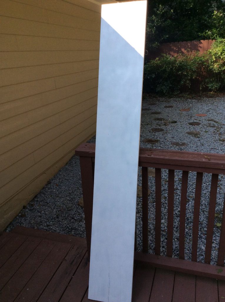
Started with this…
*
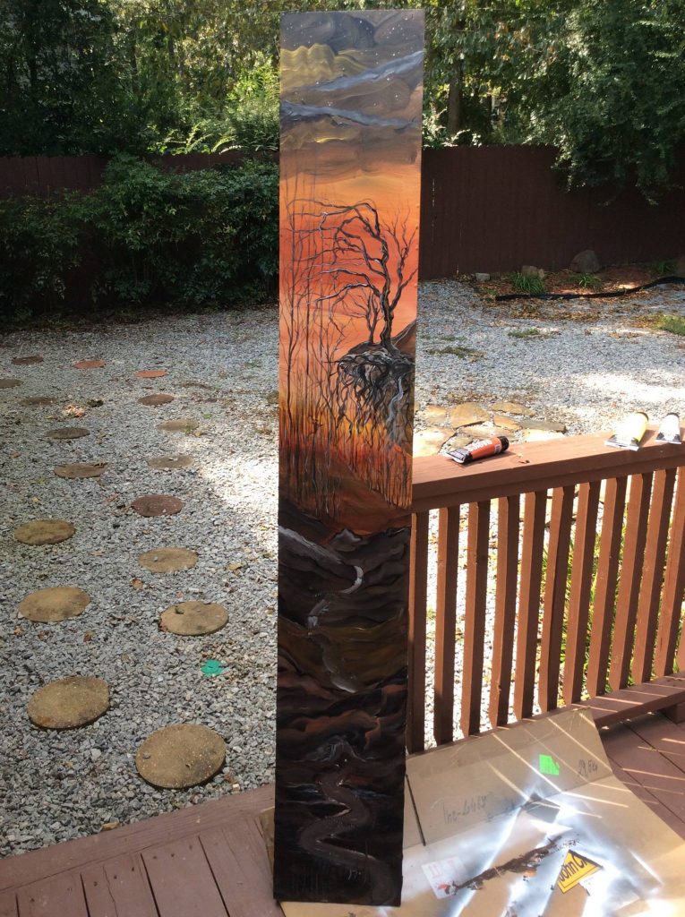
…and finished with this.
*
I admit I loved making these so much, I’ve got another six planks drying on my deck right now. Meaning…more are soon to come.
*
Want to learn more? Hit me up on Facebook, Twitter, or via email.
And…you might also like these.
On a lonely Friday eve, long after midnight slid by, I stood before a black canvas with the last drop of white paint clinging to my paintbrush.
Songs a bit dramatic, right?
Anyway, I made good use of the white paint.
And out came my latest painting, Night Emperor.
Night Emperor
*
And of course, Night Emperor needs his bride. Here’s ‘Frozen’ sculpted and painted by artist (and lady of the night) T. Morrison:
Frozen
They make quite a pair, don’t you think?
For art inquiries, hit me up on Facebook, Twitter, or via email.
If you like Night Emperor and Frozen, you might also like these.
I’d just finished working on several highly-realistic sketches.
…and my pencil hand was tired.
To ease my mild suffering, I picked up a huge (24×48″) canvas and went after it with green, black, yellow, and white paint.
The result was…well…
Sylvan Eternity
**
…big.
I enjoyed every second of painting this giant landscape. Now it’s back to cover art work.
Prints are available here.
For art inquiries, hit me up on Facebook, Twitter, or via email.
If you like this painting, you might also like these.
I’m wandering in a strange artistic realm.
Somewhere between this and this.
On a rainy Saturday, with a glass of scotch in hand and Chris Isaak roaring in the background, I decided to consume my largest remaining canvas.
…and paint green clouds, dark terrain, and tall, hollow tombs.
Introducing the Grave Towers:
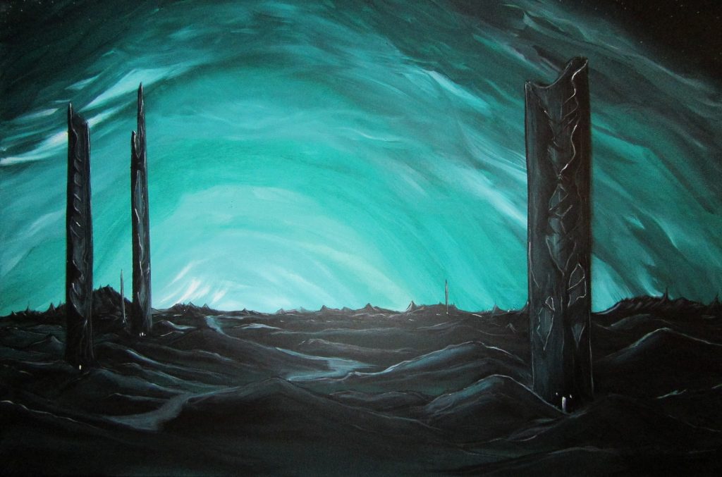
The final painting. Bleak and green. Were I a better photographer, you’d get the deep shading and details.
**
This is the background, which I painted on a chilly Friday night. Some people have told me they prefer it without the towers. Meaning…I’ll probably paint a tower-less version soon.
*
If you liked this painting, you might also like these.
I suppose I’ve always been fascinated by Asian style art.
Trees. Landscapes. Buildings. Dragons.
…all so different from Western work.
I tried to let it inspire me while painting a duo of large acrylic canvasses.
Did I succeed?
You be the judge…
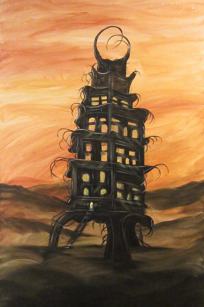
Tower of Souls
Tower of Souls was sort of an accidental painting. I painted a deep gold background while having no idea what to focus on as the subject.
And then it came to me. An eerie tower…full of ghosts.
As ever, it was a true pleasure to paint with bold blacks and deep, rich ambers.
*
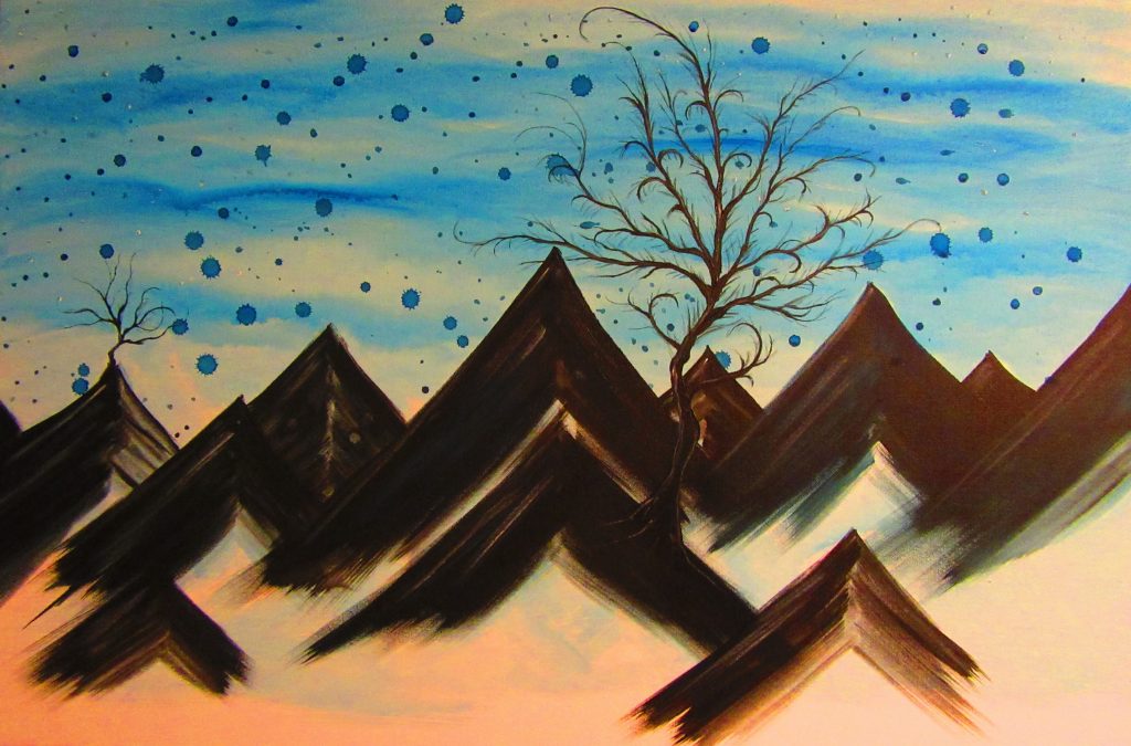
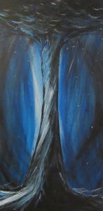
Winds of Forever
For Winds of Forever, I tried to be a bit more focused. I wanted to do a bigger, bolder version of this. The blues remind me of a perfect winter day. No clouds. A chilling breeze. A sky drifting into forever.
Pretty sure I’ll keep Winds of Forever for my private collection.
*
Thanks for stopping by. More paintings are soon to come.
Prints are available here.
For art inquiries, hit me up on Facebook, Twitter, or via email.
If you like these, you might also like these.
In the beginning, I preferred to draw, paint, and sculpt demons and dark imagery.
And lately I’ve returned to my roots…
*
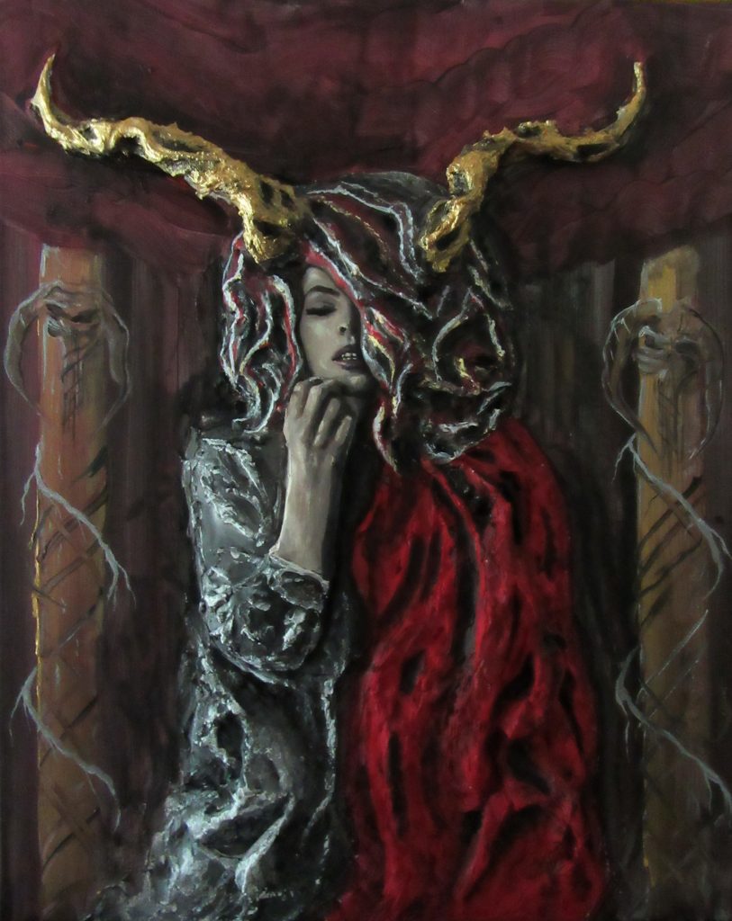
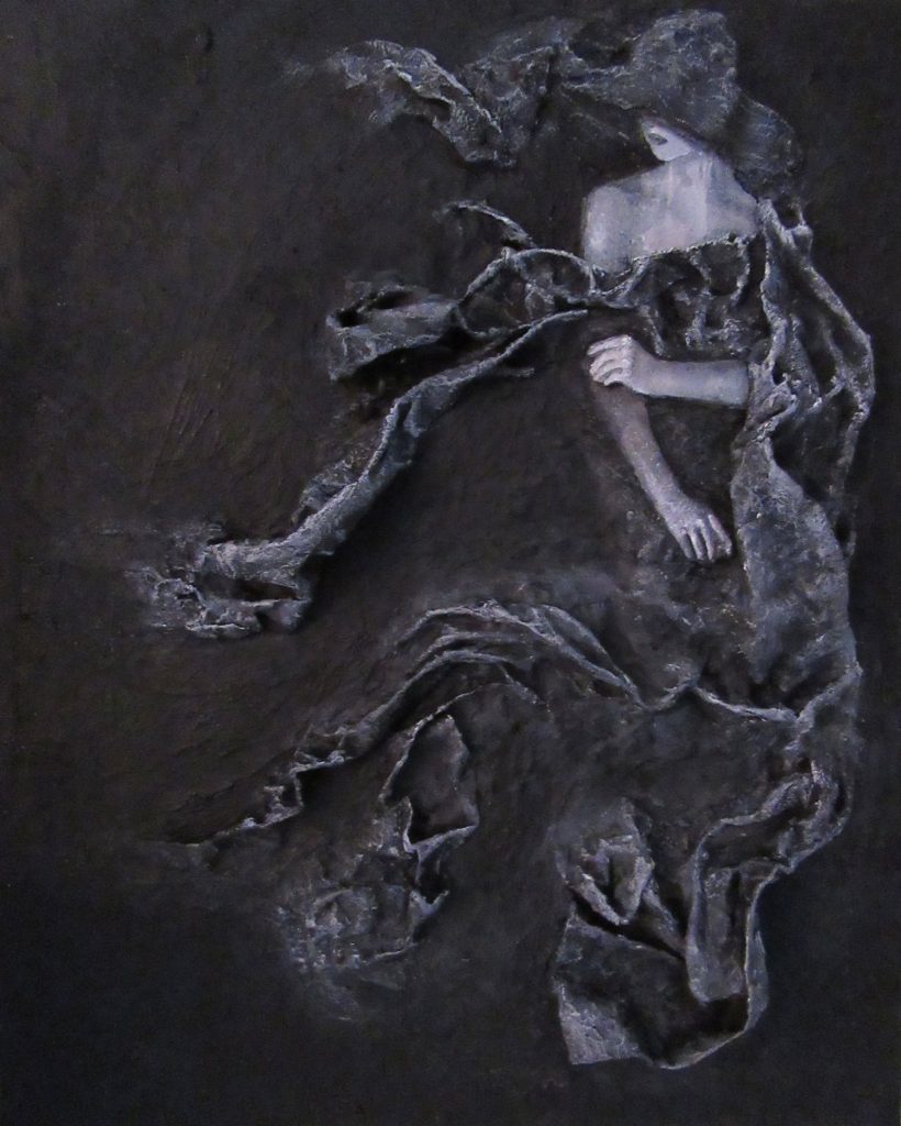
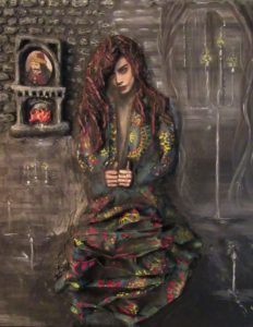
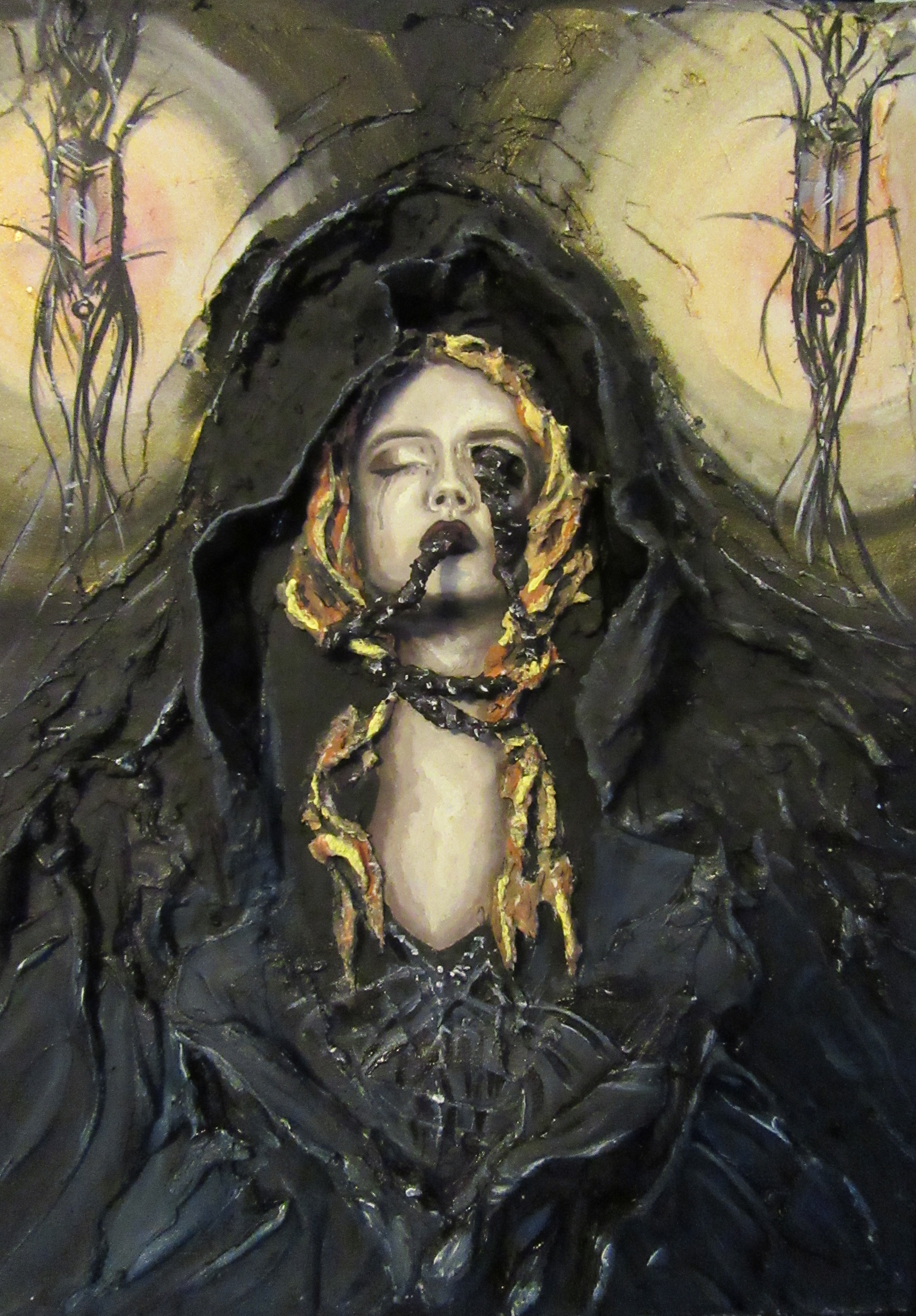
Sacrifice
*
The girl in Sacrifice was conceived and sculpted by artist T. Morrison, who then handed me the canvas to paint a deep, dark background.
I went with abstract demon pillars.
Because…why not?
*
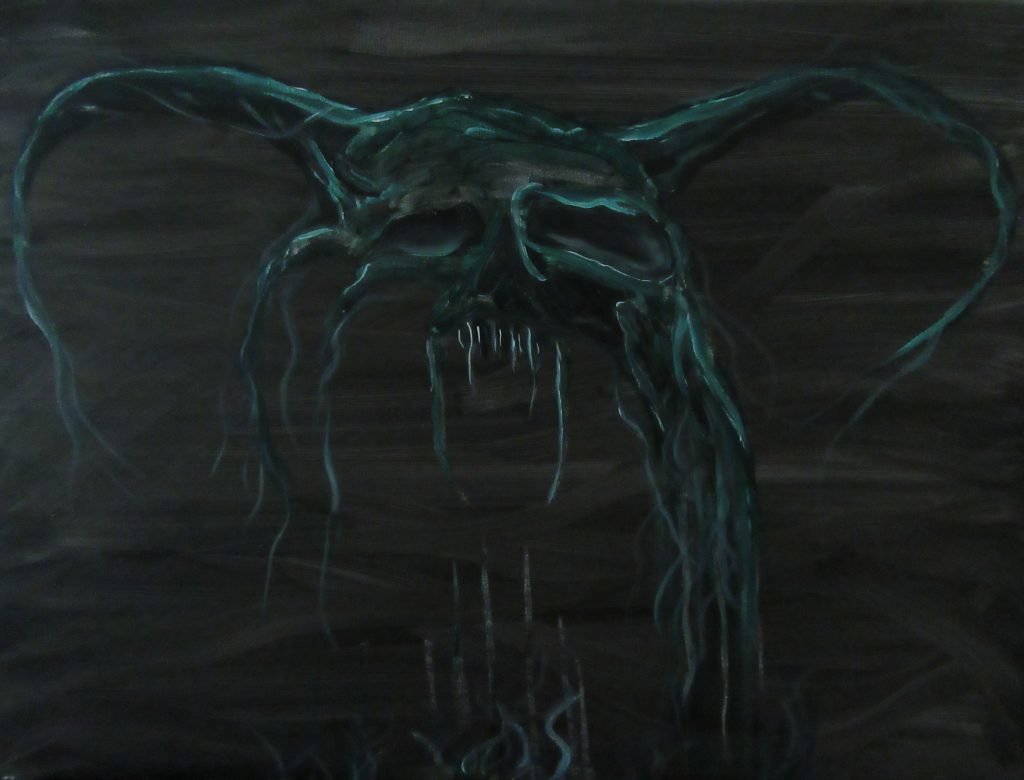
Malevol
***
For Malevol, I waited until the latest hour of the night. I wetted my brush with blacks, greens, and ghoulish whites, and I worked fast.
And this guy dripped onto the canvas.
He’s big in real life. 18×24″.
My kid wouldn’t let me hang it in his room. Go figure.
**
Thanks for stopping by. More paintings are soon to come.
Prints are available here.
For purchase inquiries, hit me up on Facebook, Twitter, or via email.
If you like these, you might also like these.
We’ve recently ended our long-standing Thought for Every Thursday series.
It may one day make its return.
But for now, please enjoy the first installation of Thursday Art Fart…
*
Dark cities…
Wasted landscapes…
Unholy dwellings…
These are among my favorite types of art to create.
And so I have.
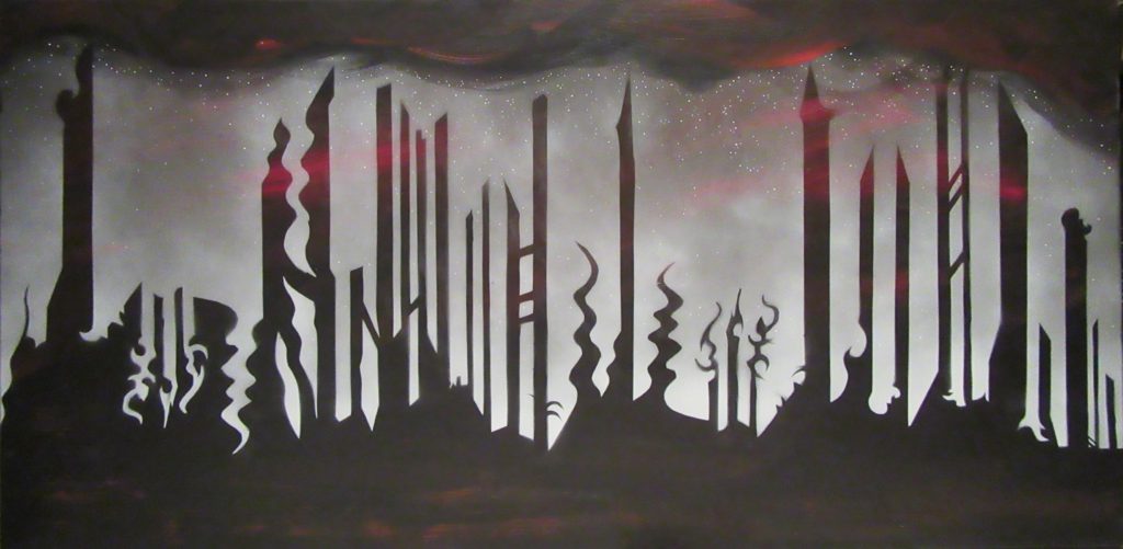
City of Nowhere
*
City of Nowhere – 24×48″ is among my more massive of my works. To make it happen, I slathered an entire canvas with red and black paint. After the base layer dried, I carved a stencil into two large poster boards and applied white spray paint to the non-blocked out areas. And then, to top it off, I dotted a few white stars and added some glossy black acrylics to the individual towers.
Boom. It’s huge. And I’ve nowhere to hang it…
*
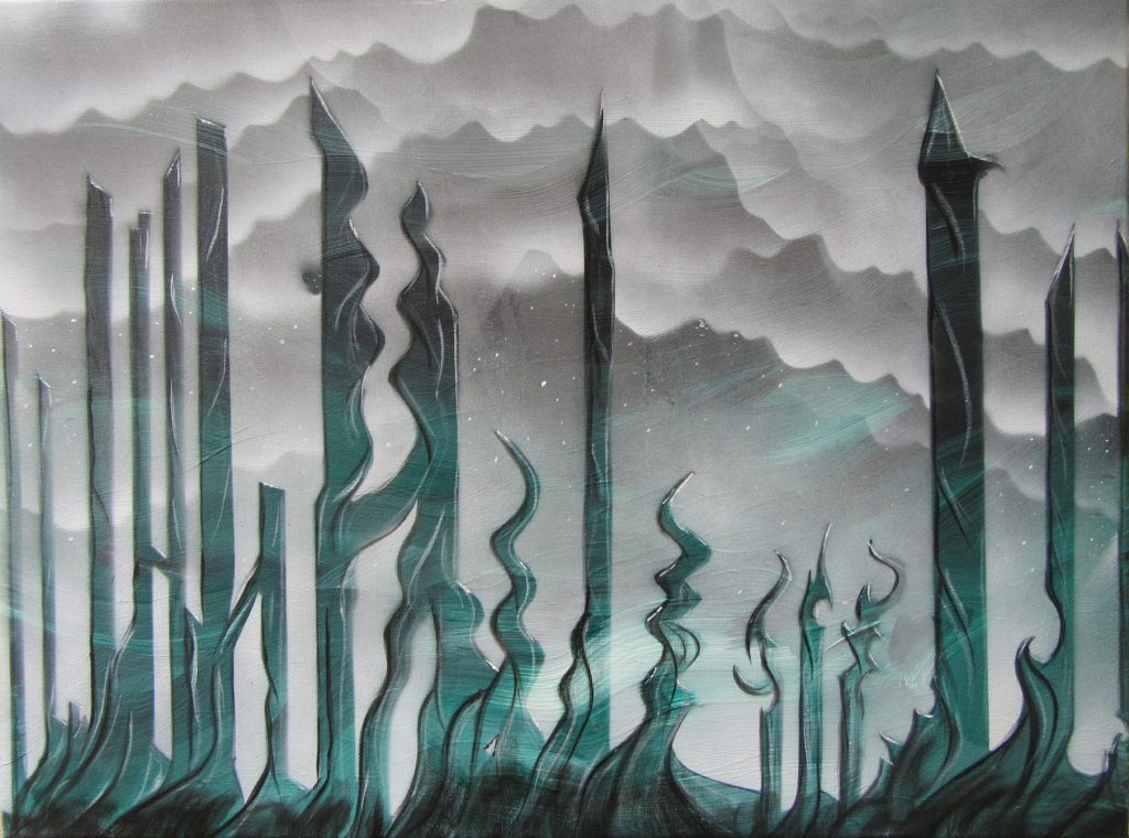
Dark Oasis
The stencils for City of Nothing were so time-consuming to cut, I felt I had to use them at least once more before tossing them. And so the necropolis of Dark Oasis was born. Creating the clouds with spray acrylics was a blast. Detailing the swirls within the towers…also fun. Dark Oasis is smaller at 18×24″.
I’m not sure which one I like more.
Oh well.
Prints are available here.
For purchase inquiries, hit me up on Facebook, Twitter, or via email.
If you like these, you might also like these.
The tricky part about creating a best-of artist list?
…you can’t usually post an artist’s creations without ticking them off and destroying copyright protections.
It’s ok. We’ll figure something out.
Here’s ten artists who’ve shined a powerful light on me (and my walls.) They’re in no particular order.
Allen Williams, master of graphite powder, lord of graphite, is among the most interesting illustrators and conceptual artists I’ve ever stumbled upon. He’s done film work, but the works I’m struck by are his weird, ghoulish drawings, posted regularly for sale right here.
My absolute favorite piece by Allen? This monster here – The Lotus King.
*
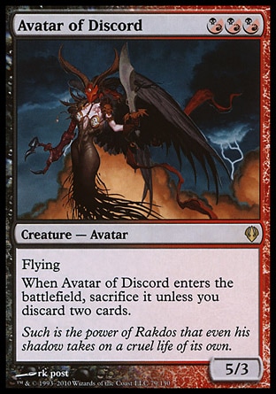
RK Post
Back in my days of playing Magic the Gathering, I discovered the best part of the game is the card art. A host of excellent illustrators toils to create some pretty fascinating monsters, angels, and otherworldly entities, all for players’ enjoyment. RK Post’s art is likely my favorite. His sometimes harsh, often dark images bring MtG to life.
His website is here. He creates unique alternate versions of his MtG cards here.
And one of my favorite RK Magic cards is:
*
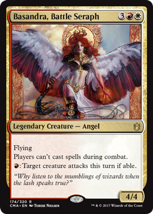
Terese Nielsen
If RK Post is my favorite MtG illustrator, Terese Nielsen is a close, close second. She blends strong realism with wild, barely controlled elements, and I love it. Angels, goddesses, beautiful women, strong men, powerful animals…she’s a master of them all.
Her website is here. A fine selection of her best Magic the Gathering cards is here.
*
Bastien LeCouffe DeHarme
Sometimes one stumbles upon an artist whose concepts and execution demand immediate attention. Bastien is one such person. Based in France, he specializes in women, often mixing them with mechanical and/or fantastical elements. His themes are often dark and tormented (my favorite) and his execution when blending realism and the abstract is stunning.
I have several DeHarme prints on my walls. Just sayin’.
Enough of my gushing. Go look at his portfolio right here. And yes, some of his work is NSFW.
*
H.R. Giger
Sadly, the lord of the Xenomorphs has passed to the next world. Thankfully his creations remain. Surely most people have watched the Alien movies, and yet H.R. (Hans Ruedi) Giger created far more than just a few creepy extraterrestrials. His mastery of biomechanical, necromantic paintings, sculpture, and other media are unparalleled.
I first discovered Giger’s work (Meister und Margeritha) on the cover of a Danzig album.
A selection of Giger’s art books is here.
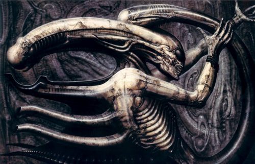
Necronom IV. (Photo: H.R. Giger)
*
It’s true. I accidentally discovered Jeremy Mann years ago while Facebook stalking a mutual fan. Whatever. Simply put, Mann’s oil paintings and photography are stunning. He specializes in portrait work and breathtaking cityscapes, sometimes blending his subject matter with a dark edge. Like most of my favorite artists, he walks the line between utter realism and abstract fantasy. Just look at his women here (NSFW.) And his unbelievably haunting cityscapes, implying rain and twilight, are here.
It’s worth mentioning Mann prefers not to sell prints. You’ll have to hit up one of his galleries or buy one of his premium (and personalized) art books if you really, really want to be a fan.
*
John Howe
It’s probable that during the creation of the Lord of the Rings movies, Peter Jackson could not have chosen a better illustrator than John Howe (and Alan Lee.) John’s sketches, landscapes, and character work captured LOTR’s theme in a way perhaps no other could match.
His website is a bit clunky. Doesn’t matter. Check it out anyway.
It’s definitely worth mentioning that John Howe is also an experienced and talented swordsman. He believes the best way to understand objects and motion is to hold, use, and touch the object to be drawn or painted. I tend to agree. Completely.
You owe it to yourself to check out the special features on the LOTR DVD boxed set. Kick back and check out John Howe and Alan Lee’s superior art
*
Alan Lee
The second half of LOTR’s dynamic art duo is Alan Lee. He’s a master of watercolor paintings, often depicting surreal landscapes with incredible detail. His creation of faerie-like forest scenes, with writhing branches and strange, ethereal colors, is particularly inspiring. Alan not only worked as an illustrator for the movies, but also has his hands in several Tolkien-related art books, all of which are worth every penny.
Chase Alan’s fascinating art on Facebook.
An interesting bio of Alan appears here.
*
Marcela Bolivar
I count myself lucky to have found (again by accident) Marcela’s art via Facebook. Marcela is a photo-illustrator specializing in digital recreations of stunning photos. While I don’t typically adore digital art, for Marcela (and a few others) I make exceptions. Her work, especially her women and surreal natural scenes, provide elegance and eye-candy all art-lovers can likely appreciate.
You need to check Marcela’s website here. Especially the stunning piece ‘Hydroponic.’ Thank me later. 🙂
*
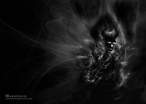
Amanda Makepeace
Lady Makepeace is a humble dweller of the central Georgian woodlands, and just so happens to be my personal favorite cover artist. Yeah…I’m a fanboy; her painting Autumn Waters hangs right next to my favorite art pieces at home. She’s an illustrator, using both digital and traditional media to portray mythical creatures, magical birds, wondrous woodlands, and the occasional terrifying sci-fi monstrosity.
Her website is here.
Amanda has created stunning cover work for several of my novels, including:
*
My own not-nearly-as-amazing-as-the-ten-artists-above art can be found here.
Collaboration is the name of the game.
Sculptor T. Morrison & I have been doing it in spades.
She invents wild ideas, sculpts them with lightweight spackle, and I add deep, dark backgrounds. She even did a funny tutorial.
Our latest pieces have been getting ever darker. We held a challenge via Facebook to select a new painting’s theme, and the people decided on Itsy Bitsy Spider. (Sleeping Beauty was a close second.)
Only thing was…
We decided Itsy wasn’t so itsy after all…
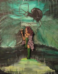
Itsy
Around the same time, we wanted to do a painting with a gypsy girl. She had to be strong. We decided she also had to be a vampire.
And so…
Blood Gypsy
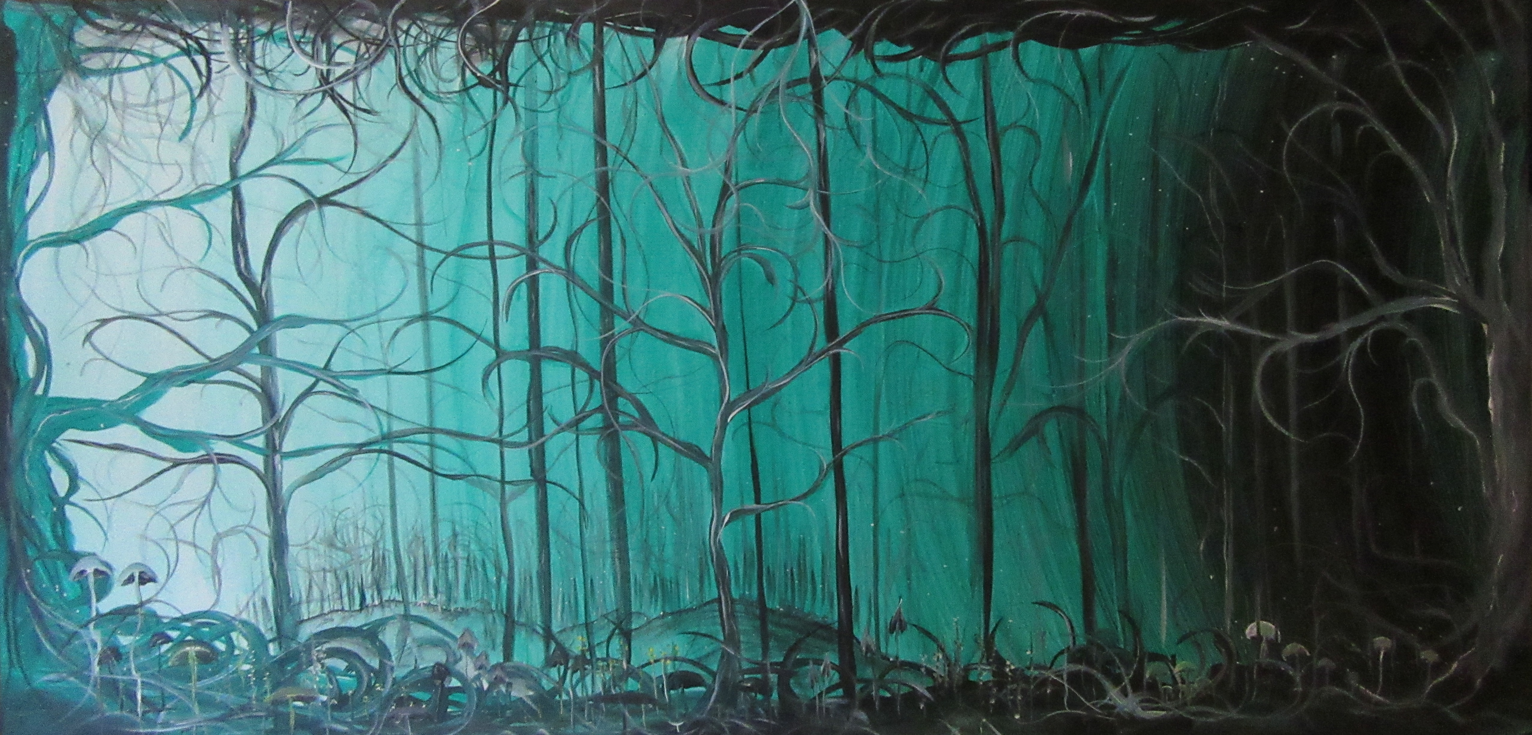
And then we went straight up spooky, crafting a haunted woodland no one would dare enter.
Would you wander here?
Gravewood
We’ll continue pumping out paintings as fast as we can sell them. We’re currently working on a Frankenstein piece, and then there’s the huge skeleton-filled tower we’re conceptualizing.
You should keep coming back for more.
Our prints are available here.
For purchase inquiries, hit me up on Facebook, Twitter, or via email.
As I publish more and more books, I find myself wanting to create my own cover art.
It’s risky business, I know. If I paint something that looks too homemade or ‘arts and crafty,’ I could repel audiences with subpar art.
I’ll probably still keep reaching out to my favorite artist, Amanda Makepeace, for all of my major novels.
But for other, stranger, darker releases, I might keep trying my own brand of shadowy art.
And so…
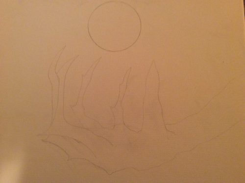
On Christmas Eve 2016 I found myself sketching a scary hand. It grasped for a magical (and of course, evil) orb of power. This little concept was born days earlier when I dreamed up my next series of novellas, currently titled Ashes of Everything. The pencil I used is the same pencil I used in high school more than 20 years ago. No kidding. The hand….is based on mine.
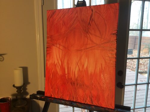
Painting fire is fun! I mixed up soft watercolor reds and added depth as I reached the canvas’s edge. The pencil-sketched hand is still under there, just barely visible enough for me to fill it in with blacks after the flames were complete.
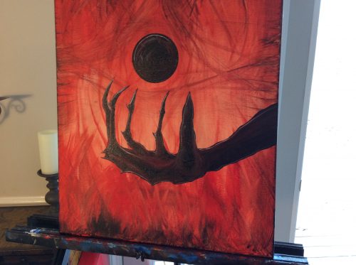
Ah, the claws, the grasping fingers! Those who’ve read my Tyrants of the Dead series might remember whose hand that is. Those who haven’t, well…what are you waiting for? But seriously, texturing hands (especially demonic ones) is no easy thing. I spent countless hours shading, darkening, and highlighting each finger.
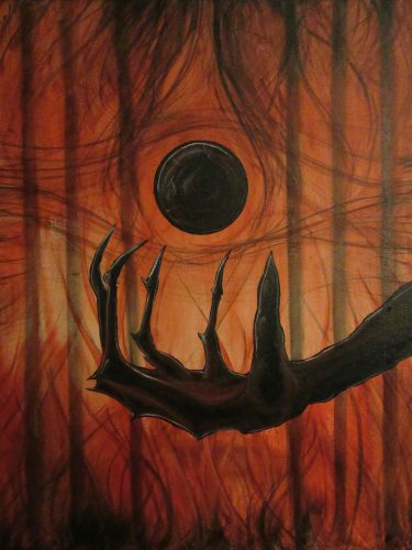
The more I toiled, the darker the painting became. The flames deepened. Black prison bars appeared in the background, representing the demon creature’s imprisoned state. This is the final pre-varnish image. I was very pleased with how it turned out. It’ll most likely make the cut as a book cover in the next few months.
If you liked this Painting with Darkness entry, check out the other fourteen: I, II, III, IV, V, VI, VIII, IX, X, XI, XII. XIII, XIV.
To dive into the series that inspired this piece, click this.
Until next time…
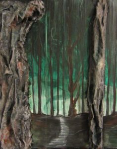
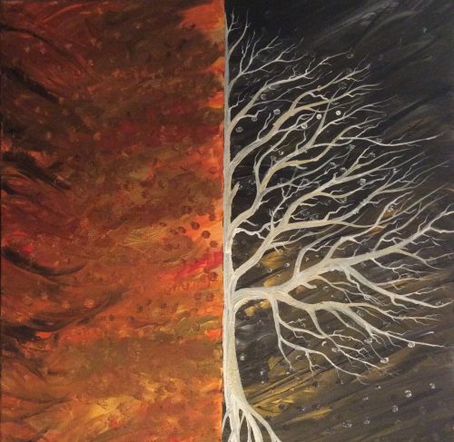
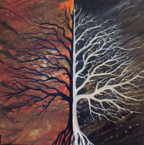
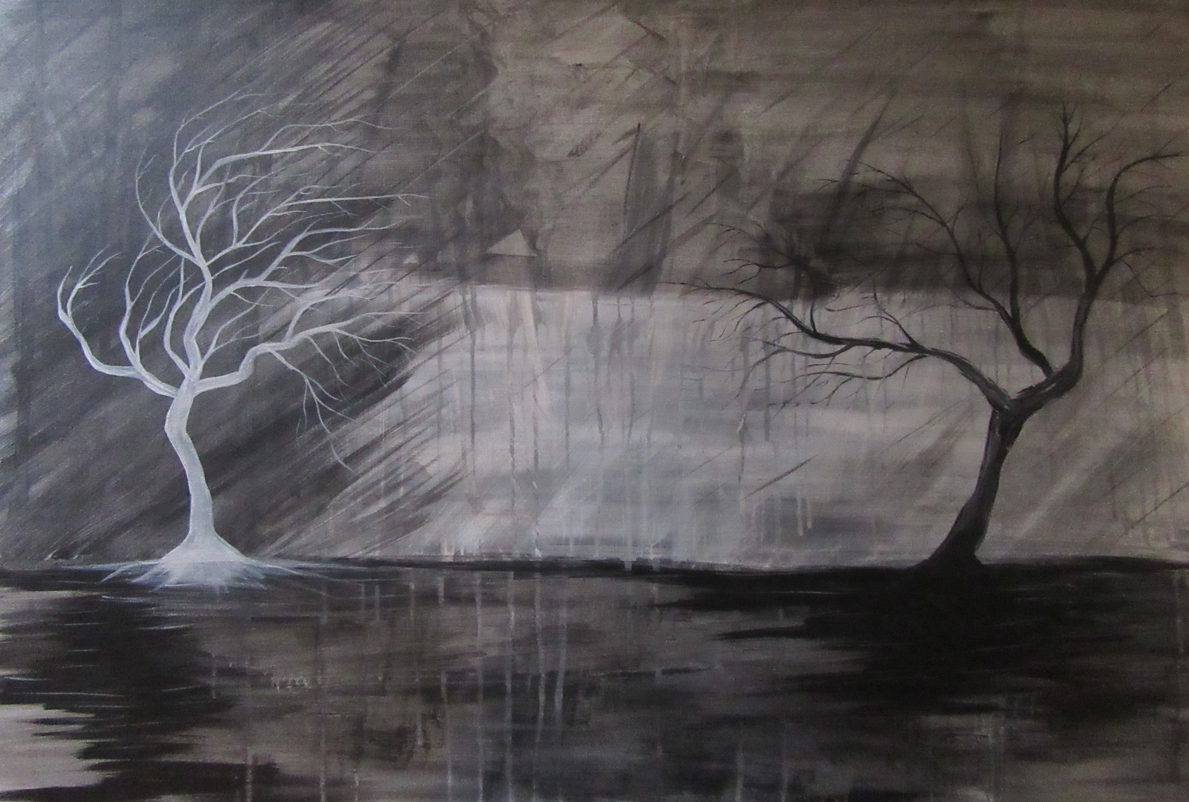
I like to paint trees.
A lot…
Sometimes, even when I start a new canvas with every intention of painting a castle, a spooky city, or some other dark imagery, my brain misfires and takes control of my brush. Before I know it, I’ve painted yet another tree. I can’t help it. I’m a slave to impulse.
Knowing this, I decided to do a series of paintings to get all the trees out of my system.
And along came four little paintings, one for each season:
‘Deep’ – for spring
‘Midnight’ – for summer
‘Umber’ – for autumn
‘Dusklight’ – for winter
I thoroughly enjoyed painting this series. These simple, yet fun paintings have a way of calming me. After working on them, I sleep better, I’m relaxed, and life feels easy.
You should try it sometime…
For previous Painting with Darkness entries: Part I, II, III, IV, V, VI, VIII, IX, X, XI.
It’s been a little while.
I’ve been focused less on art and more on invading the universe with my latest novella.
So anyway…
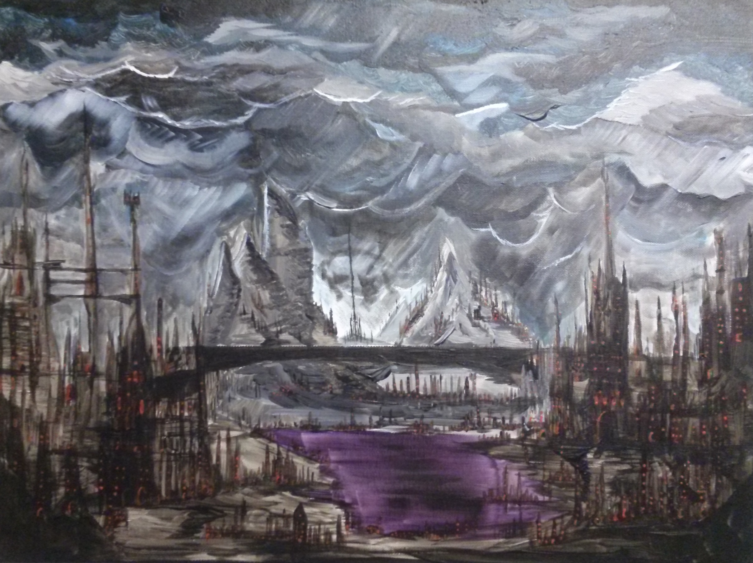
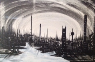
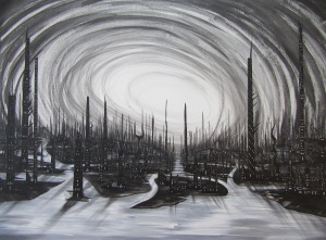
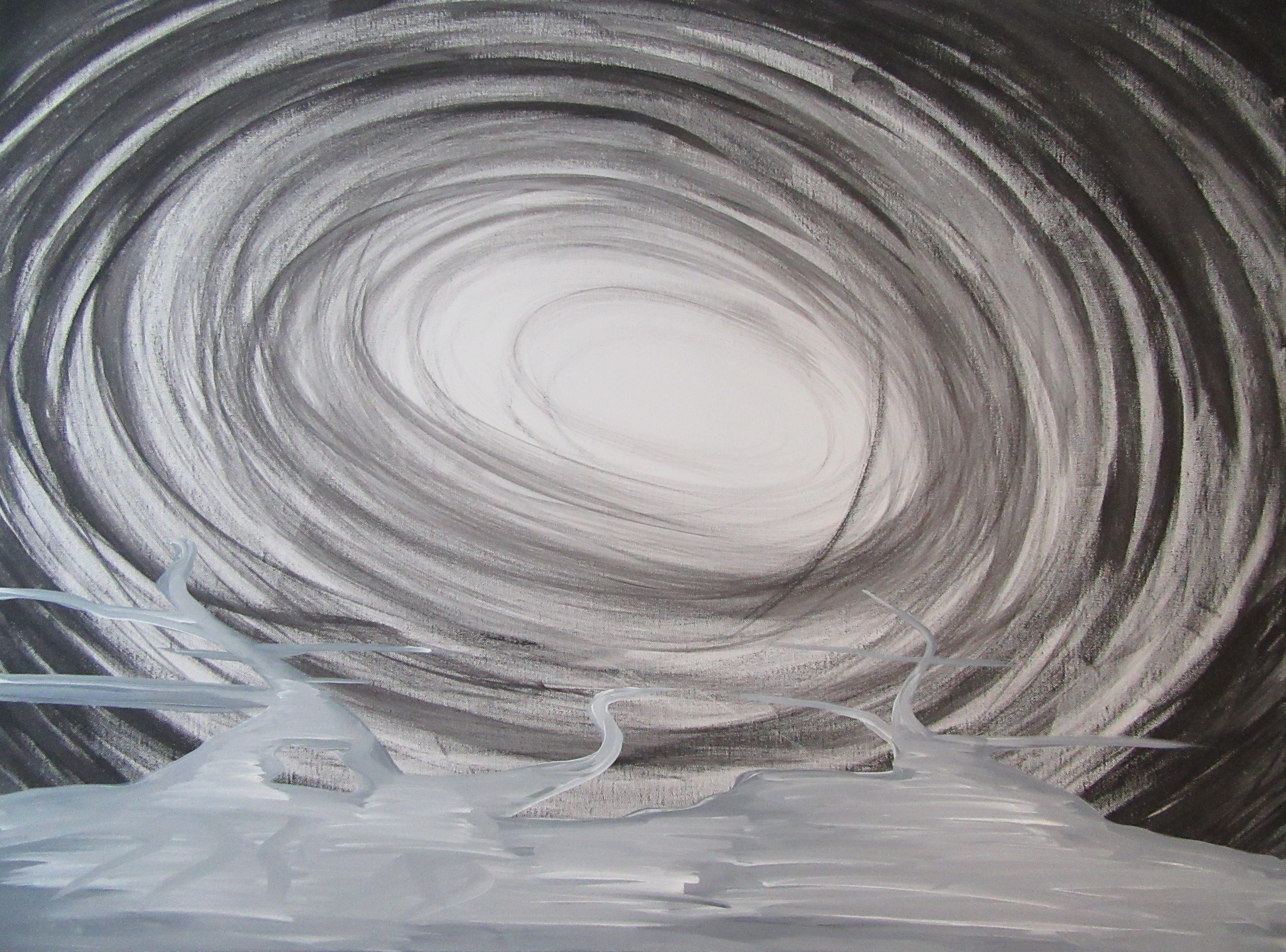
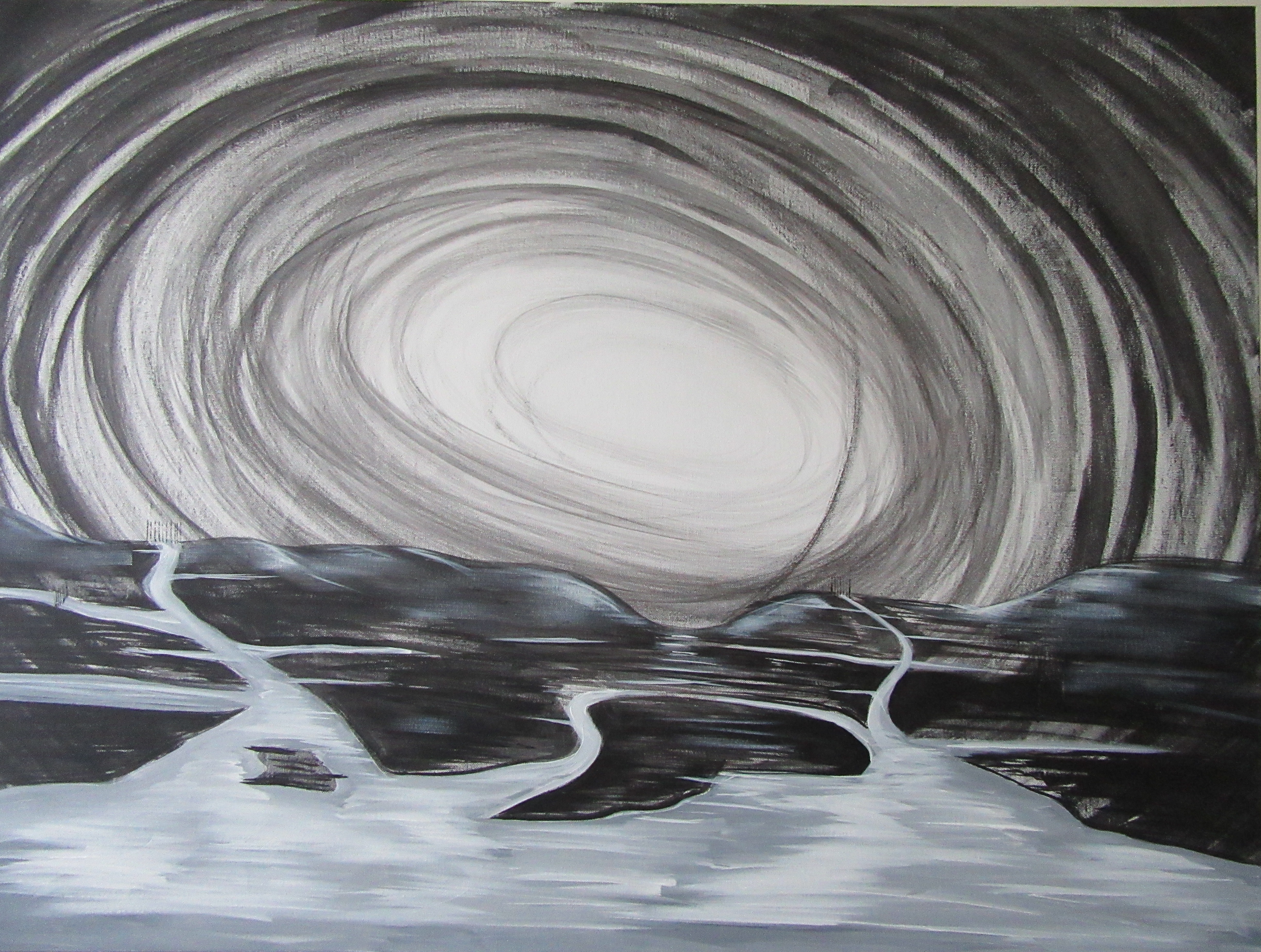
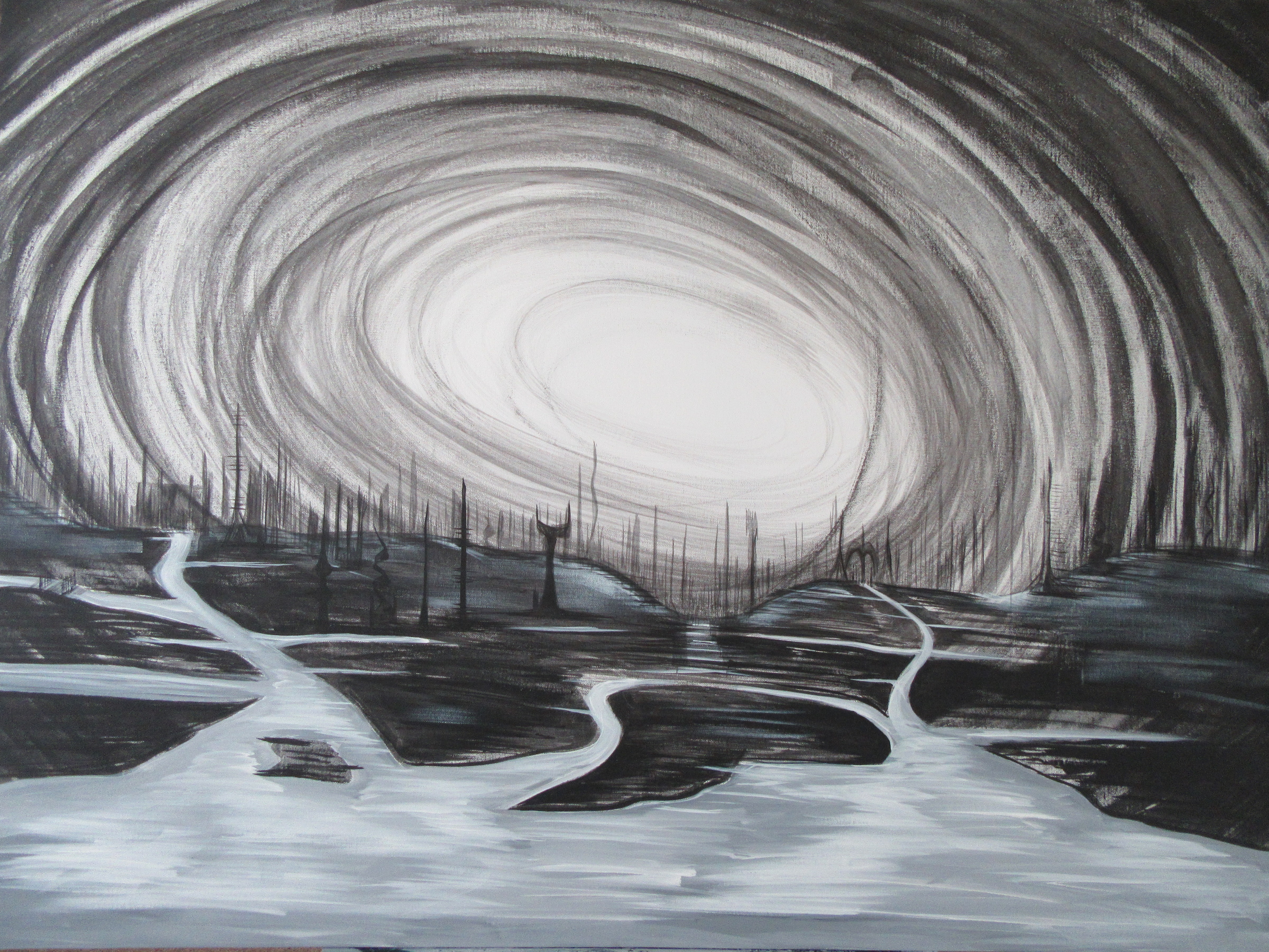
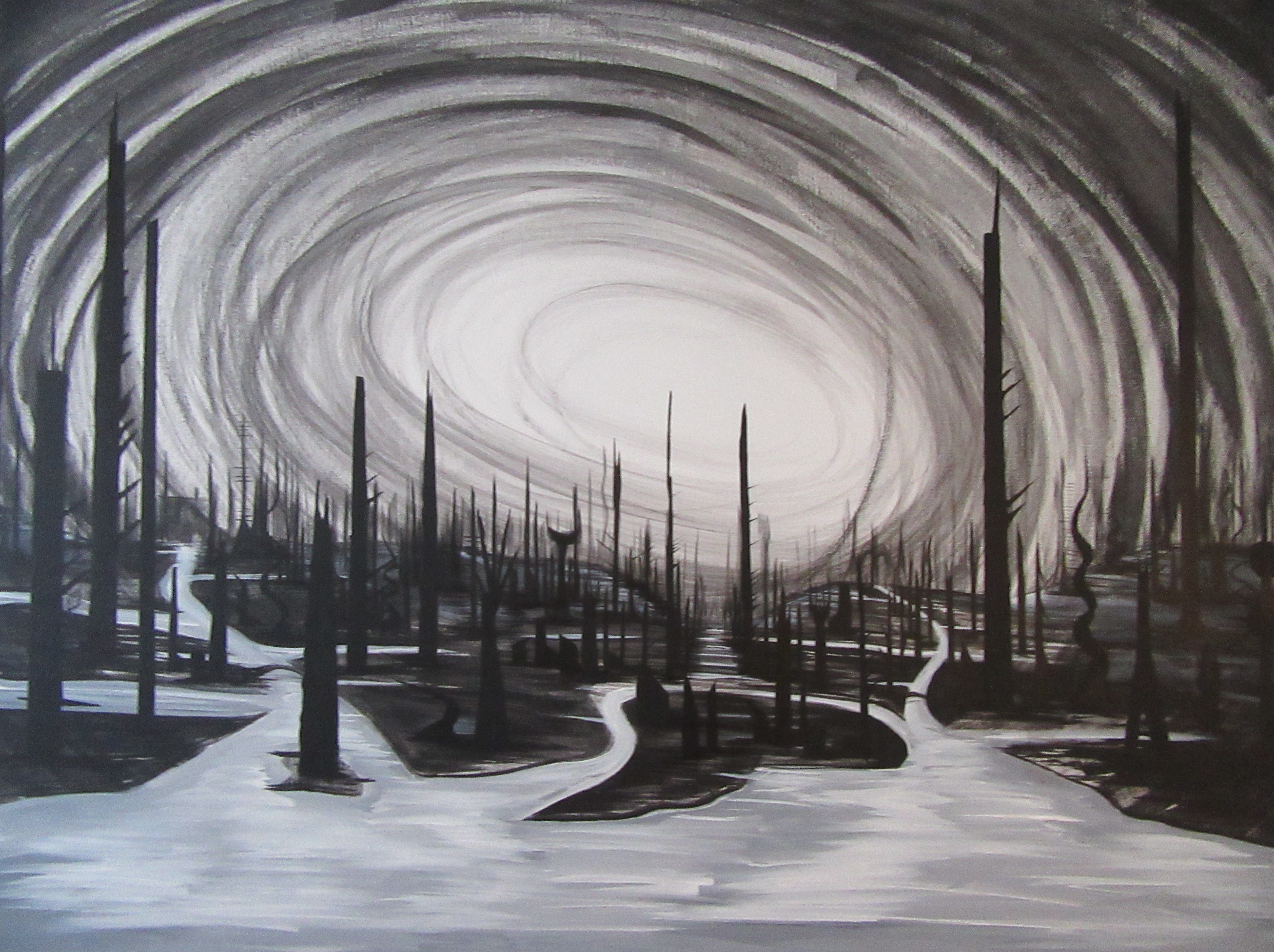
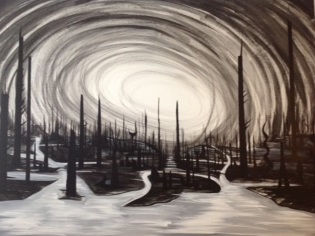
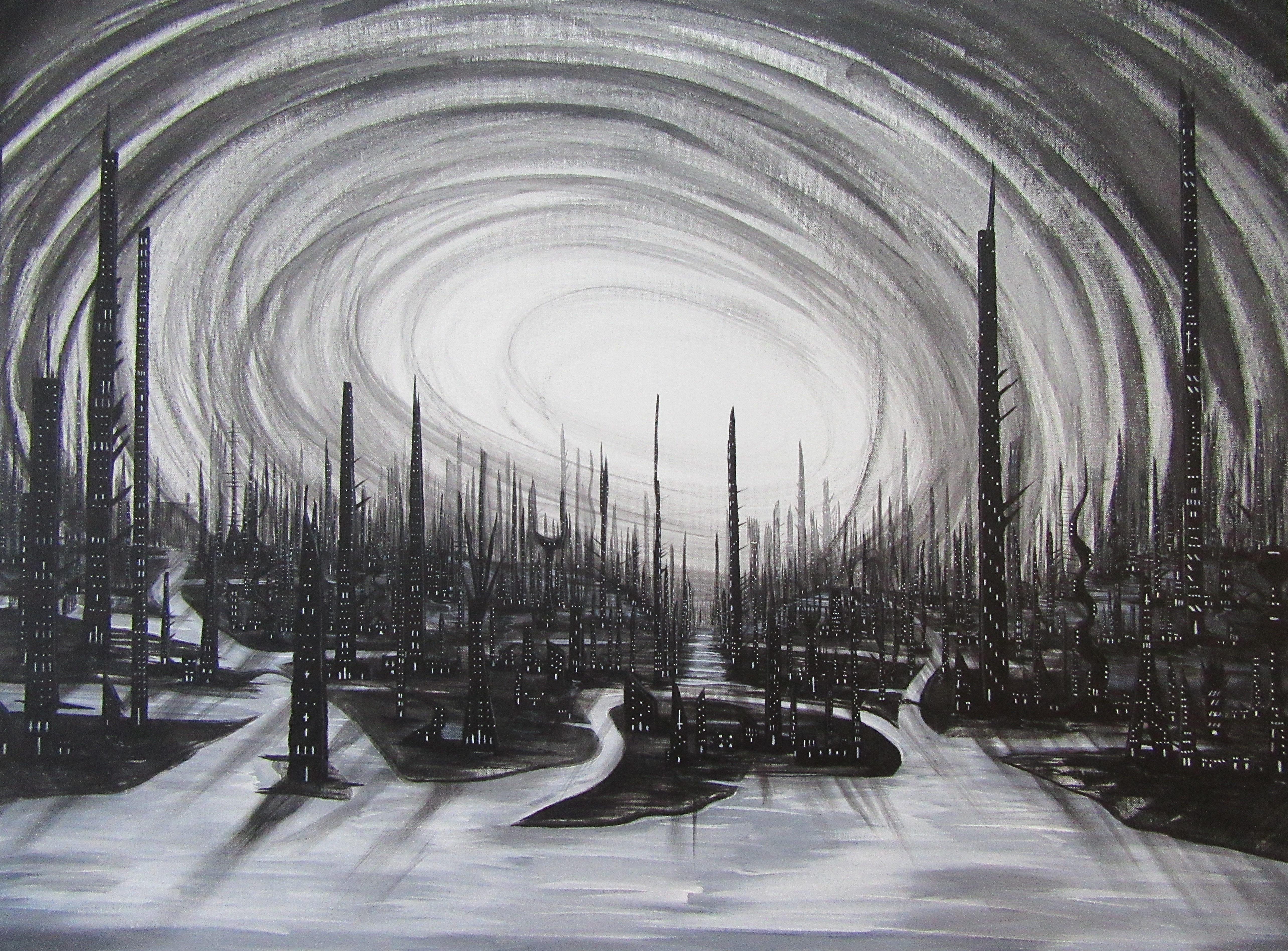
I recently decided to go over the top with another shadowy dark city painting. I love using the black & white color scheme…and I love eerie, otherworldly images.
Thus was born ‘Dead and Dreaming,’ the latest of my acrylic paintings:
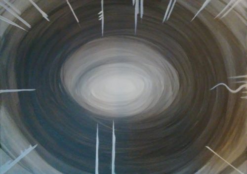
It all started with a blank 16″ x 24″ canvas. I blended water, black, white, and a splash of glow-in-the-dark paint. While I’ve yet to expose the painting to enough light to activate the glow paint, I noticed this particular blend made the swirled pattern go on super smooth. Those white dagger-like things…well they’re the first of many towers to come.
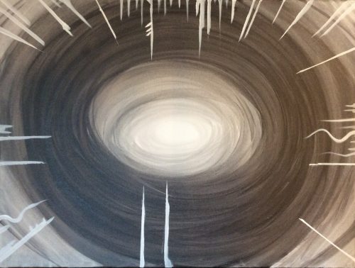
The most daunting parts of this painting? 1. Using a bookmark as a straightedge to get most of the towers with nice, flat sides. 2. Doing the math to make sure a large percentage of the towers were directed at the right angle to ‘surround the swirly abyss.’
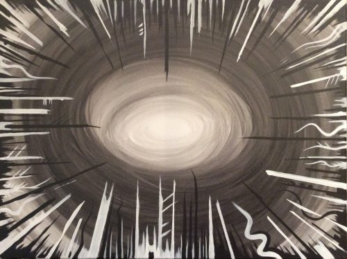
So…after I added all the white towers, I moved in with my preferred color: black. I wanted the dark towers to be taller and more swordlike, almost as if they wanted to reach all the way into the swirly abyss. The effect was a trippy, alien cityscape. I was pleased.
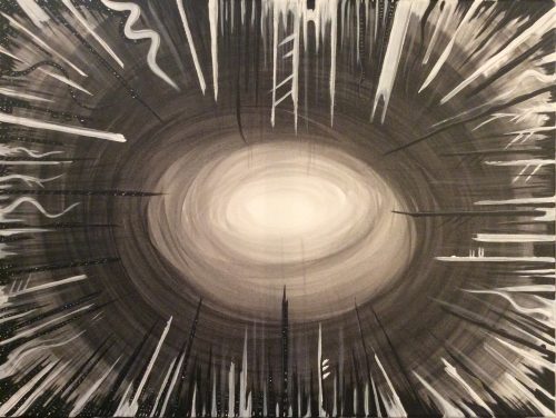
You might have to enlarge the image to see it, but this is where I started to add shadows and ghostly windows to every…single…tower. I’ve done paintings like this before, particularly with The Emperor’s Vision, but the added challenge here was rotating the painting to make sure I didn’t miss a tower.
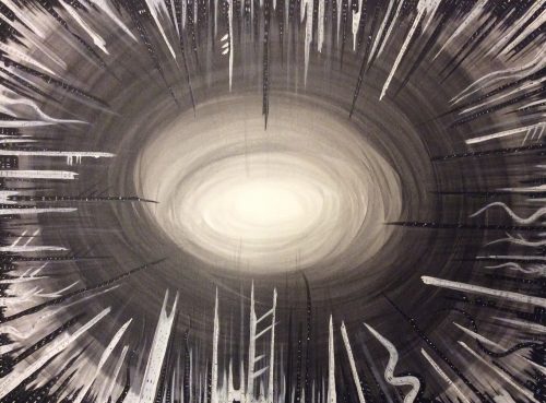
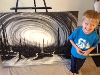
The finished painting. Hundreds of towers. Thousands of tiny windows. About 12 hours of painting time. I’m ecstatic pleased with the result. After a few matte coats of varnish, this one is going up on my wall until it sells.
The original canvas for Dead and Dreaming is now available for sale right here.
Prints and other materials are available for sale on my Society6 page.
For previous Painting with Darkness entries: Part I, II, III, IV, V, VI, VIII, IX, X.
After a short layoff, I’m back to doing terrible things with my paintbrush.
Dark cities, twisted terrains, and this time around, an eerie, abstract tree.
I call this one, ‘The Last Autumn.’ The original is for sale here, if you’re interested.
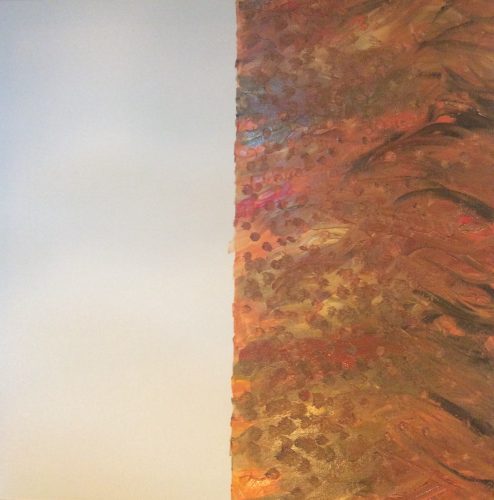
It all started with a 24″x 24″ super-thick white canvas. I used a straightedge, a level, and a twenty-year old pencil (yes, really) to divide the canvas into perfect halves. With my little wooden palette, I paired up acrylic golds, blacks, reds, yellows, and whites. I mixed them at random, and when I was done with the first coat, I poked golden dots all over the right side of the canvas. Voila. What you see above.
For the left side, life got a little easier. I mixed gold, black, and umber, and went nuts with fast, broad strokes. Before it dried, I poked little white ‘leaves’ into the background. The difference between the two halves was stark. I loved what I was seeing.
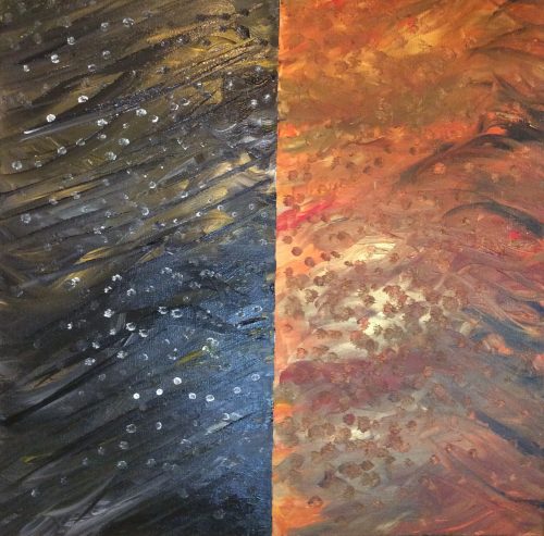
About 0.0003 seconds before starting with the right-side tree, I had a revelation. A. I wanted to flip the painting over so the darker half would be on the right and the red/gold half on the left. I have no idea why. It just felt right. B. I pulled out a sand-based gel with which to paint the tree. For those not familiar, the gel adds a texture you can see and feel when you’re up close to the painting. It’s so ridiculously fun to paint with; I suggest everyone try it.
For the left side of the painting, I mixed pure black with more sand gel. I used four different brushes, starting big and working down to the tiniest branches using pretty much the smallest acrylic brush you can buy. It was tedious, but I loved it. Each flick of my wrist gave life to a new branch. The picture here is pre-varnishing; the sand gel takes forever to dry. The plan for this painting is to use a heavy gloss, which will make the colors pop and allow The Last Autumn to be a centerpiece for any room.
Thanks for reading!!
To buy The Last Autumn, go here.
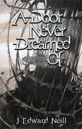
Author of Matrix-like A Door Never Dreamed Of.
And creator of the Coffee Table Philosophy series.
Maybe more than all my previous Painting with Darkness articles, this one has special meaning.
It’s the only piece I’ve done in the last three years that I didn’t work on in my epic painting studio.
And it’s the first I finished in my little shoebox apartment.
No matter…
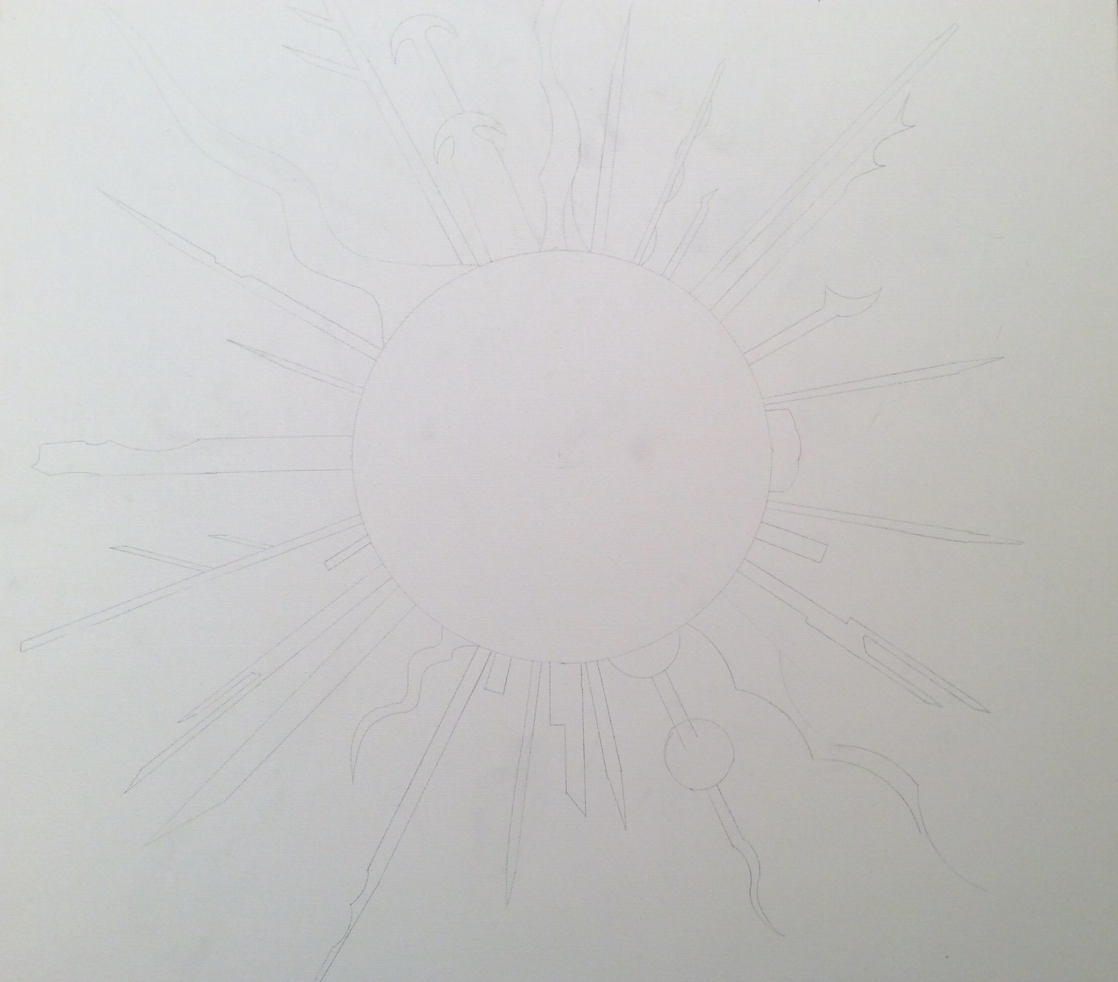
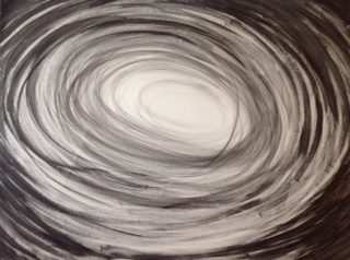
I hope you’ve got your reading glasses on. This is the soft pencil work I put on the canvas before a single drop of paint ever touched it. I’m not gonna lie; the geometry was challenging. See that circle in the center? It’s dead-on in the middle down to the millimeter. What’s special about it? To trace the circle I used the 60-year old mixer bowl my grandmother many times used to make my pancakes.
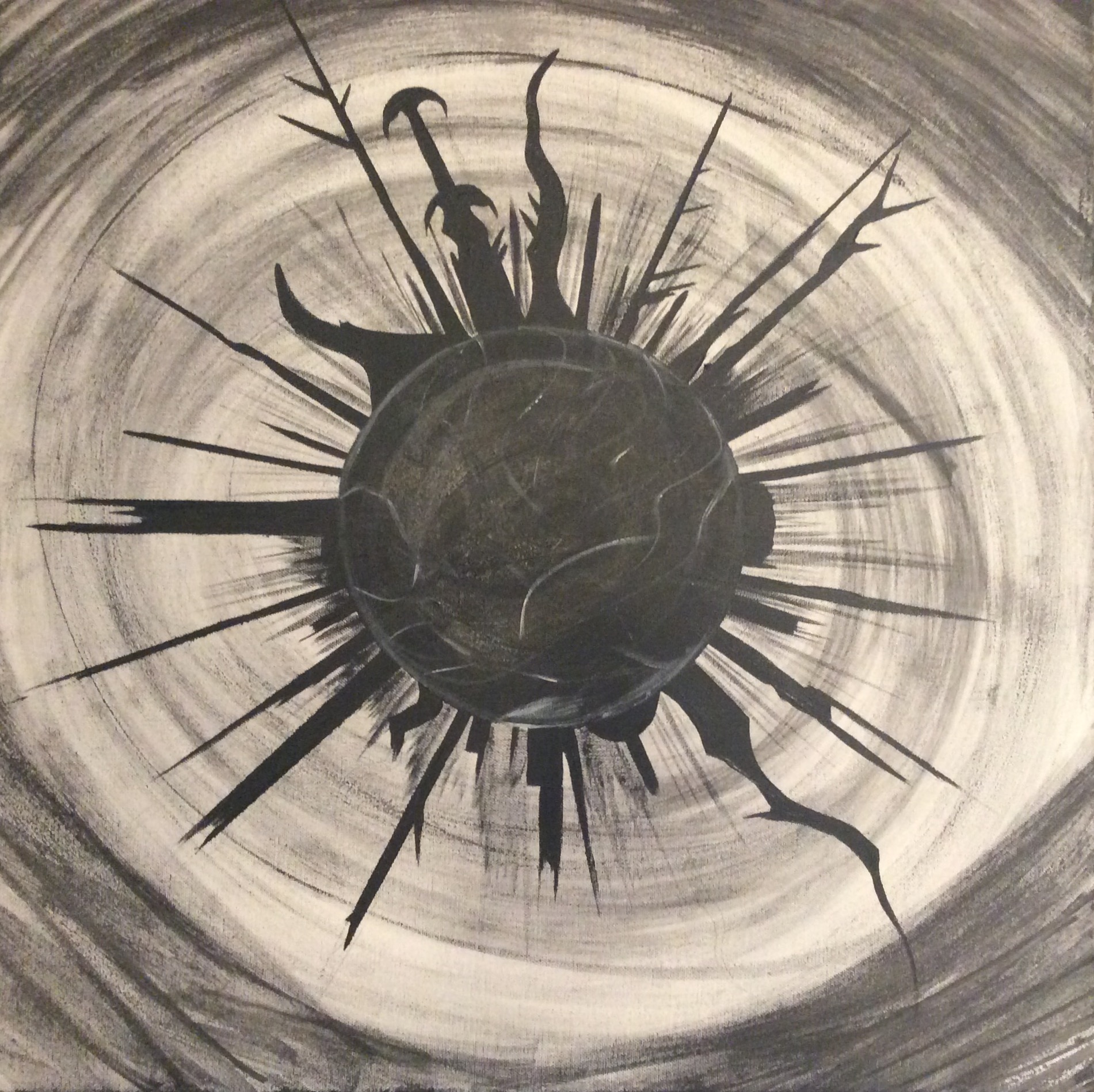
Begin the darkness: First I swirled watercolor blacks and sepia tones in the background. Then I used a hard straight-edge to paint in the black ‘towers’ jutting out of the sphere. And then…I added even more sepia and filled in the center sphere to give it depth.
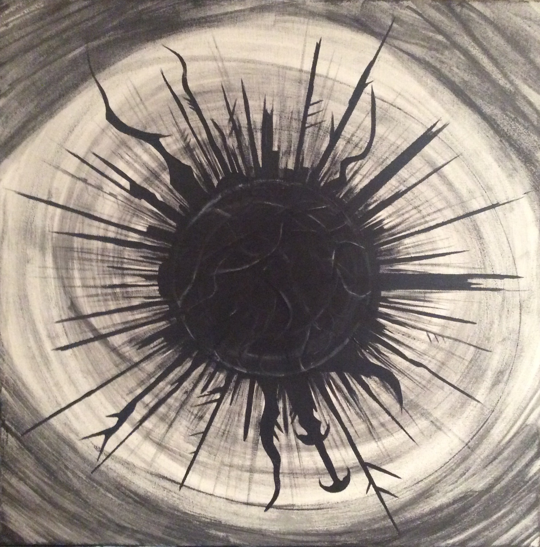
More towers were needed. I realized I hadn’t added enough. Also, I darkened the center sphere. Also also also…I used pale watercolor blacks to slice in distant towers behind the hard, sharp foreground towers.

What can I say? I wanted even MORE towers. In this shot, although it’s hard to see, I used whites to give the towers a reflective quality. Like they’re made out of polished obsidian or some hard, dark otherworldly metal.
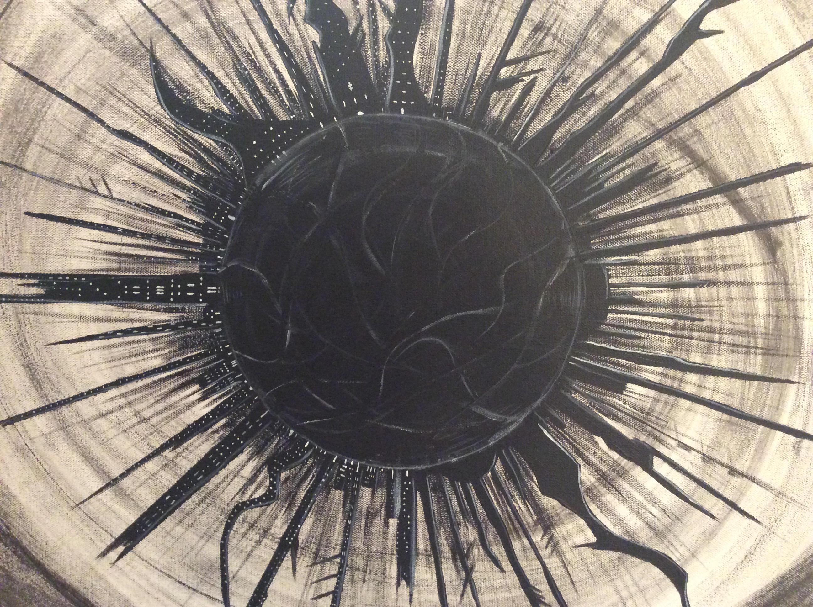
Now began the hard part. And by hard I mean TEDIOUS. Using a tiny brush and some titanium white paint, I started adding windows and doors to the towers. I imagined a ghost behind each window…and NOT a friendly one. At the time this picture was taken, I’d spent two hours just dotting in windows and adding texture to the towers.
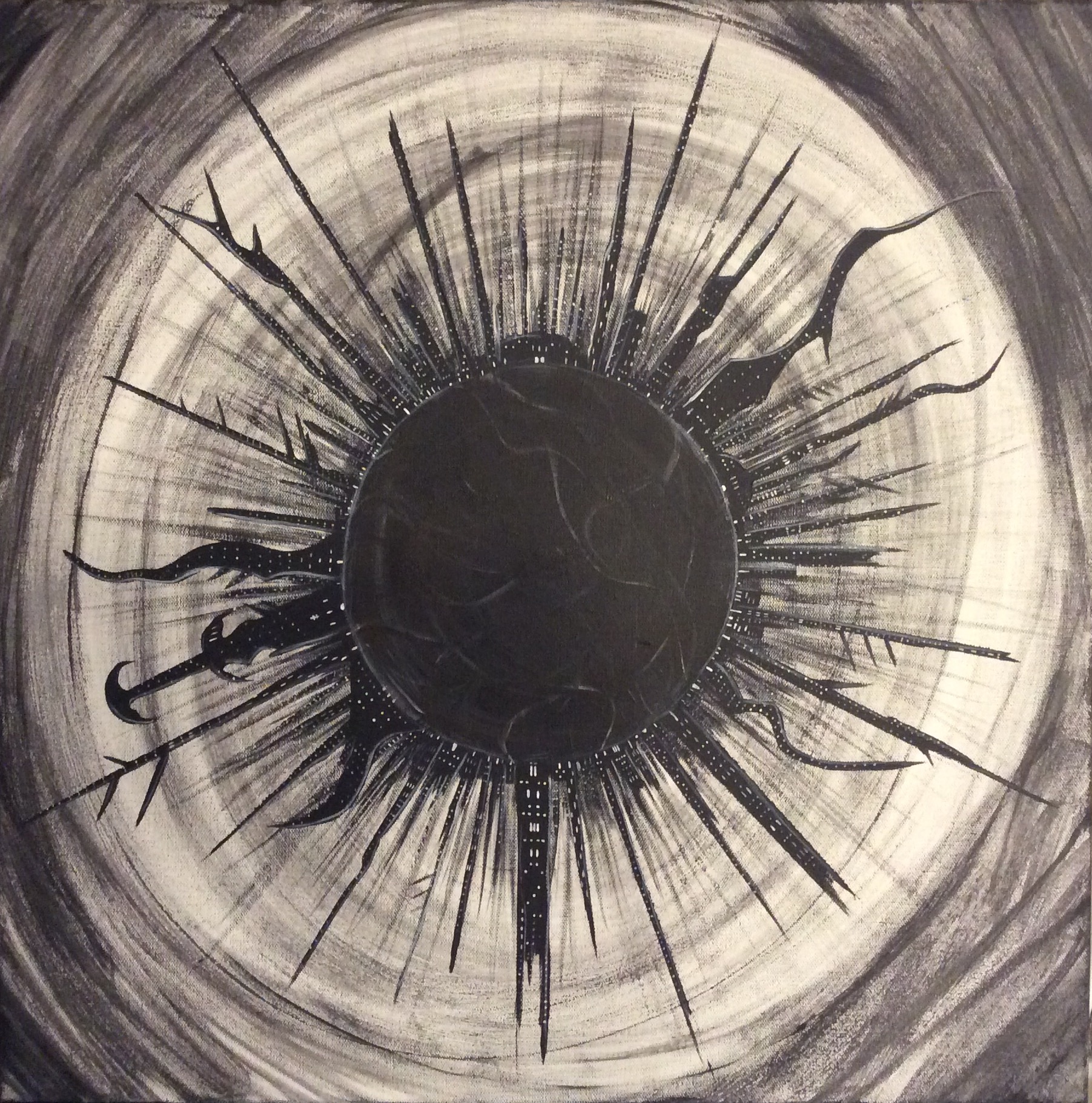
Ghostscape – the final image. I like how the ring of lower tower lights frames the center of the sphere. It’s kind of a never ending city swirling around a tiny, terrifying planet. So…anyone up for a vacation?
Now…the only question is:
Which way to hang it?
In other words, which towers should point up, and which should point down?
Hmmmmm…
Love,
Author of novels A Door Never Dreamed Of and The Hecatomb
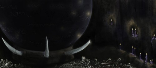
It was long and difficult journey to publish my first three fantasy books.
I spent ten years writing them…then another two years in rewrites.
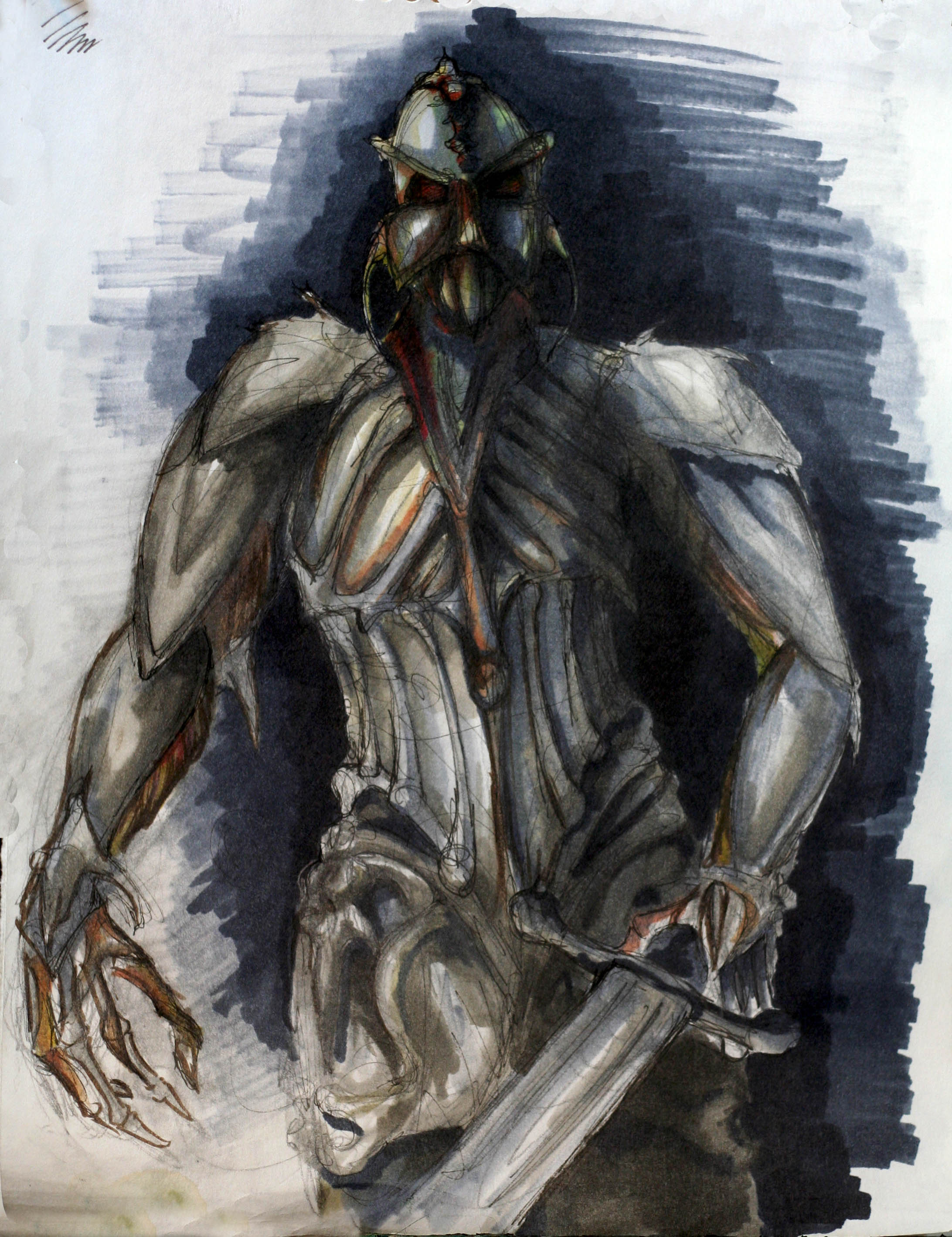
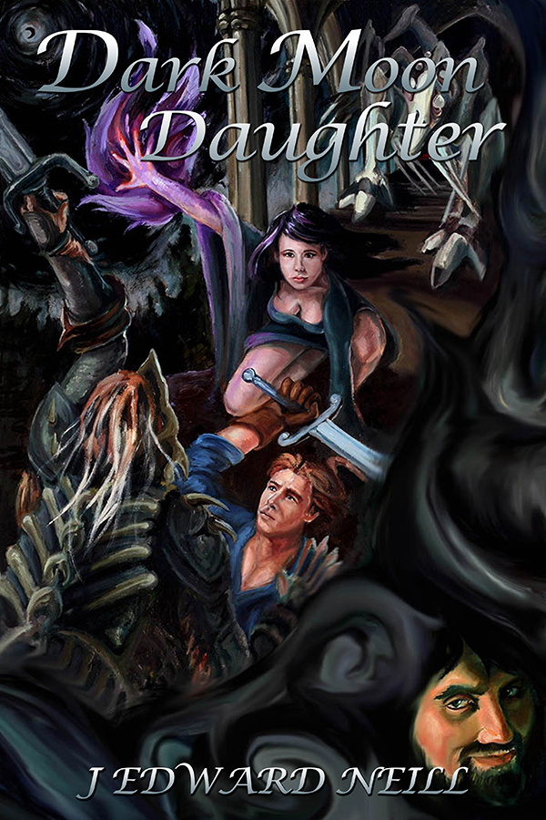
Along the way, I created and commissioned a ton of art for the series. Some of it was inspirational. Other pieces were meant as cover art, and still others for marketing.
Today I’ve brought a ton of it together. Think of this as a unified sketchbook. It includes pieces by the elegant Amanda Makepeace, the gifted Eileen Herron, and the super savvy Damonza.
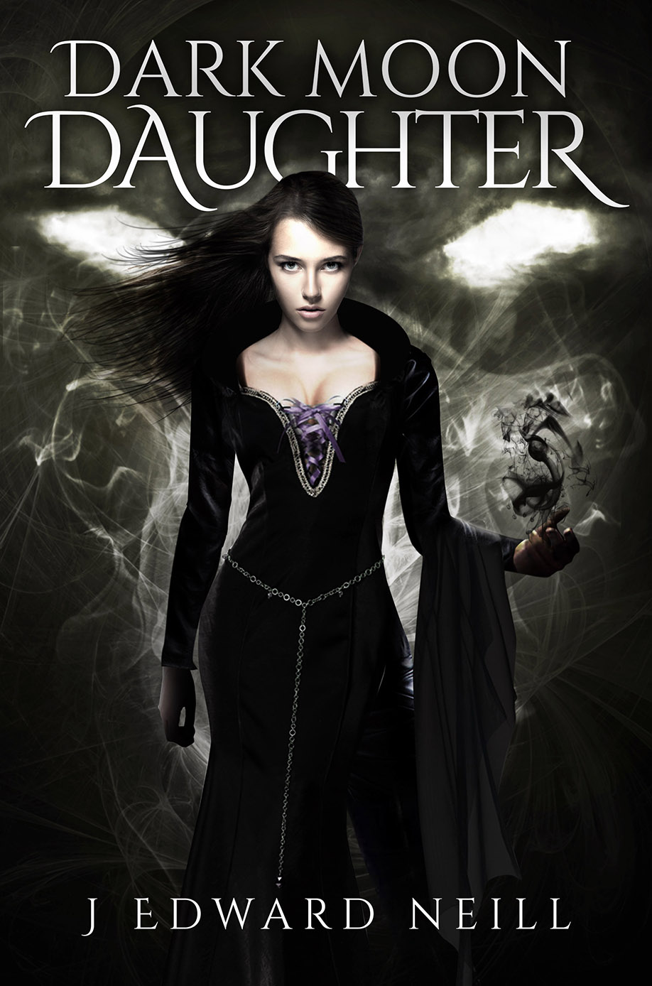
Please enjoy the art of my Tyrants of the Dead series, which includes the novels Down the Dark Path, Dark Moon Daughter, and Nether Kingdom:
*
*
*
*
*

*
 Here’s a huge canvas painting I did called ‘Illyoc.’ It’s a bit abstract, I admit. It’s a view of the dark stronghold Malog, as seen from a balcony.
*

*
*

*

*

*
**
*


*
*
*
*
*
*

*
I hope you enjoyed this glimpse behind the scenes.
Love,
In recent weeks, I’ve been working with my paintbrush more than I’ve been writing.
Turns out slashing with paint gets the darkness out of my system much faster than hammering on a keyboard.
And so I thought I’d share:
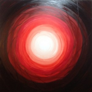
‘Fire Lens’ – 36″ x 36″
Fire Lens is 3 lbs of canvas. It’s huge! The photo here is somewhat muted, but the live version is lustrous and dark, a shining white eye wreathed in deep crimson and black. It’s a room dominator, to be sure.
*
‘Dripping’ – 36″ x 22″
Dripping was a tortuous painting. It started as a watercolor experiment and became much more. I saturated my paints with as much water as they could hold (while still maintaining a bit of grey/black) and went to work. The acrylics drained down the canvas. The white lines you see are drip marks, which is exactly what I wanted. The muddled blacks and gruesome greys are where I let the watered paint form into little puddles. This is one sad, cold painting.
*

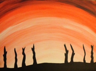
‘Sunshine’ – 16″ x 12″
My kid, the G Man, won’t let me paint without him. He’s done almost as much canvas work as I have! Here’s a quick multicolor work he named Sunshine. It’s a stark contrast to my darkness, which I love about his method. He says this is what the sun looks like up close. Pretty close, right?
*

‘The Hecatomb’ – 30″ x 20″
Most of my work is without purpose. I just paint what I want and let the brush fall where it may. Not so with The Hecatomb. This large canvas was created with a book’s front and back covers in mind. The book by the same name will be out soon. It’s a sequel to this and this.
*
If you liked these, here’s a few Painting with Darkness posts from history. Like this. And this. And this.
And the darkest of all my art appears on these.
Until next time.
After securing a 36″ x 48″ white canvas, it sat in my closet for a solid two weeks while I stewed on what to paint. Would I use colors? Blacks & whites? What would be the subject matter? And once I finally stacked the canvas up on my easel, life got precarious. Each brush stroke threatened to topple the easel and ruin everything. I had to be like Muhammad Ali: “Float like a butterfly, sting like a bee.”
*
Surfaces started to take shape. Pale rivers flowed from the hills into a deathly ocean. Things were looking stark already. I loved it. And yet, while making wild ovals and grey hills was fun, it was by far the easiest part. Life was about to get harder.
*
Ocean of Knives was meant to be a companion piece to my novel, Down the Dark Path. I began adding watercolor towers (knives) in the distance. Like snowflakes, each ‘knife’ had to be different. Some were forked, others straight as sin. Looks kinda barren in this pic. It wouldn’t stay that way for long.
*
Now it came time to add the big towers. To make them straight, I carved out varying lengths of posterboard and used the pieces as straight-edges. For the wavy and irregular towers, I freehanded. Raise your hand if you’d like to live in one of these things. Am I the only one? Well ok then…
*
The quality of this pic sucks because I used my iPad. But I couldn’t leave it out. It shows the towers almost fully added. I still needed more watercolors for the faraway ones. And I needed street-level buildings to fill the city out. But progress was made. By this point, I’d spent about 12 hours on the painting. Whew.
*
The finished painting – 18 hours in. See those little pale dots? They’re windows. I tried to count while adding them, but lost track at 2,000. Yes really. I figure there are about 3,000 little white windows in all. Tedious as hell, but utterly worth it. Also notice the deepened shadows the towers cast across the water.
*
Just to show scale, here’s my 4yo, G Man, standing beside the painting. He’s a bit tall for his age, but even so. The canvas is about 4 times his size.
*
While painting this bad boy, I listened to soundtracks. A lot of Hans Zimmer, David Julyan, and Clint Mansell. Nice, brooding stuff, all of it.
Hope you like ‘Ocean of Knives,‘ companion piece for Down the Dark Path.
As summer’s warmth fades and the days die earlier than before, I find myself in the studio for long stretches of time.
Some might say locking myself indoors with brooding soundtracks playing in the background and a crispy cold glass of scotch on the table is a swift road to being utterly alone.
My point exactly…
I started at the bottom with water-diluted oranges and worked my way up. With every inch gained toward the top, I added drops of red and black. Watercolors became solids. Lights became darks. The striking colors satisfied me. And the hard blacks on the bottom were fun to paint (and easy!)
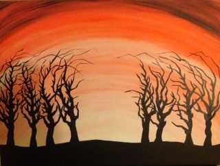
Now came the time-consuming part. At first, I worked on the trees with a 1/4″ wedge brush. Then, as the branches thinned, I used the sharpest-point brush in my arsenal. The tops of the trees began to look like claws. It was exactly the eerie look I wanted.
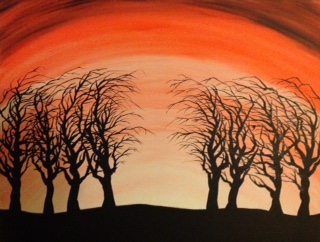
Completing the trees was a full-day task. I used my daggerlike brush to add sharpness and realism to every branch. As is always my theme, I made the trees curl toward the center of the painting…as if reaching for something unseen. I considering adding more to make this a full-blown Halloween-ish work, but decided to keep it simple. Blacks on color. Nothing cheesy. Stick to the plan of painting with darkness.
All in all, this canvas was fun and simple. In other words, my favorite kind.
The same night I finished All Hallows, I began work prep work on a huge 36″ x 48″ canvas, my hugest ever:
This’ll be called ‘Ocean of Knives’. The canvas is 3′ x 4′. It’ll take weeks to finish, for sure. Gonna need a lot of wine…
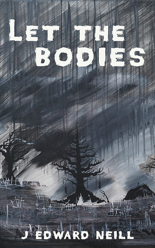
Recently, I used one of my grimmest works for the cover of Let the Bodies, my latest short story:
Painting your own cover art…fun!
And previously in the ‘Painting with Darkness’ series:
The Last Tower, Pale Swamp, Four Swords, Grave Rain
See you next time. Painting with Darkness, Part VI will feature the finished version of ‘Ocean of Knives.’
After a satisfying week during which I published my first non-fiction novel, I need a mental vacation (if not a real one…at the beach…with a pitcher of margaritas.) So this week I’d like to veer away from books to showcase six of my newest paintings. Thematically, all save one of these share similar elements. And yet all were painted with different moods in mind:
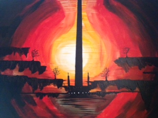
The Last Tower – An Ur stronghold floating in an abstract nether void. I was thrilled to finally get some colors going on. The floating islands I painted with a mixing knife. The white doors lead to the world’s end.
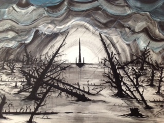
Pale Swamp – The clouds were fun, fun, fun to paint. The thicket of twisted tree limbs, maybe not so much. Again we see the Ur tower, wandering its way through yet another dimension. See the eye in the upper left?
Four Swords – I wanted to go almost full-on abstract here. I blended my fragile geometric skills with some unusual color choices. Probably my most contemporary piece. Very satisfying to finish.
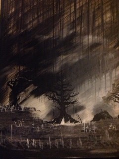
Grave Rain – Far and away my favorite painting. It started as an angelic spirit overlooking a forest. But then my mood changed, and it become something else entirely. Headstones line the sodden earth at the bottom. The center tree is home to something treacherous. For me, the only thing that comes close to watching rain…is painting it.

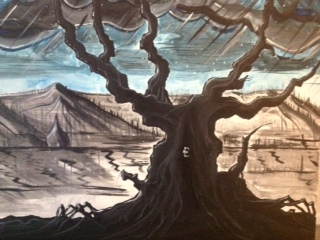
Dark Moon Cemetery – Almost certainly my simplest piece, but also my heaviest. The canvas weighs a solid 3.5 lbs. The power of the black moon bends all to its whim, including the trees.
Ashes – When I saw Amanda Makepeace’s Heart of the Forest, some dark part of me wanted to counter it with something wicked. The shadow to her light, perhaps. The evil to her good. My crappy camera failed to pick up many of the subtle details, but the actual Ashes canvas is strikingly stark. To the first one who guesses (no Google cheating) the meaning of the symbol, I’ll send a free copy of 101 Questions for Humanity.
Check here to see Amanda’s sickeningly lovely beautiful Heart of the Forest. 🙂
In other good news, I’ve just been gifted with two massive 48″ x 28″ pro canvasses. Meaning my next two paintings will be huge…and terrifying.
Buyers please look me up via Down the Dark Path’s contact link.
Stay cool.
Author of Down the Dark Path
Author of the coffee table philosophy book, 101 Questions for Humanity
