The Surreal Background Project by J Edward Neill

A new art project begins.
Surreal, abstract backgrounds for other artists to use.
Or…
For collectors to hang right on the wall.
This collection of backgrounds is meant for YOU, the artist, to paint your subject matter atop my surreal landscapes. I’ve created them in my signature style, acrylics on wood panel, ready for painting…or for hanging.
These are shipped unsigned and unvarnished. (Varnishing and signing available by request, for those who want to hang these artworks as-is.)
I’m able to create these in almost any color combination, on any size or style canvas. Message me on Facebook, Instagram, or Etsy if you’d like to place a special request.
To view the backgrounds currently available, click the pic below.


I’m offering background commissions! (But it might not be what you’re thinking…)

Hey everyone. How’s it going?

So…

At last, I’ve decided to offer something resembling commissioned artwork.

But it might not be what you think…

I’m going to offer commissioned backgrounds. Meaning, I’ll create a background (no subject matter or details) using my style. You’ll select the size of the canvas, the colors you want me to use, and the general position of the colors.

And I’ll paint it and ship it to you.

  • Artists who want to paint atop my backgrounds, this is for you.
  • Collectors who simply like my stylized acrylic backgrounds, this is also for you.

How does it work?

First, you’ll click this here link to get started.

Then…

1. You’ll select a canvas size
2. You’ll choose a color combination for me to use (choose any colors in the rainbow, but typically 2-4 colors are ideal.)
3. You’ll choose a color orientation (or select a similar painting from my huge catalog here to let me know the general idea of how you’d like me to position the colors on your canvas.)
4. I’ll paint a background using my acrylic blending technique, and when finished, I’ll send you photos of the finished background.
5. You decide whether you like the background (Meaning I’ll ship it) or you don’t like it (Meaning I’ll refund your money 100% and use the painting for my own work.)

It’s that easy.

The sizes available are:
20″ x 16″ x 1″
36″ x 12″ x 2″ (Deep-edge canvas)
36″ x 24″ x 2″ (Deep-edge canvas)
48″ x 24″ x 2″ (Deep-edge canvas)

You’ll select the canvas size upon purchase. The colors and orientation, you’ll add to the order notes.

Have questions? Track me down at my many social media outlets here.

Want to get started?

Smash this link. 

Thursday Art Assault – Dark Towers

Creepy gothic cathedrals.

Ancient dark towers.

Fantastical sky-piecing minarets.

Some of these are among my older (and therefore cruder) works.

Others are more recent.

Quality notwithstanding, painting dark towers is among my favorite things to do, second only to drawing attractive women.

Here…

The Last Tower – J Edward Neill

Ocean of Knives – J Edward Neill

Grave Towers – J Edward Neill

Gateway to the Moon – J Edward Neill

Black Light – J Edward Neill

Fortress of the Elder – J Edward Neill

City of Nowhere – J Edward Neill

*

For more, go here.

For previous art assaults, go here.

Painting with Darkness – Part X

After a short layoff, I’m back to doing terrible things with my paintbrush.

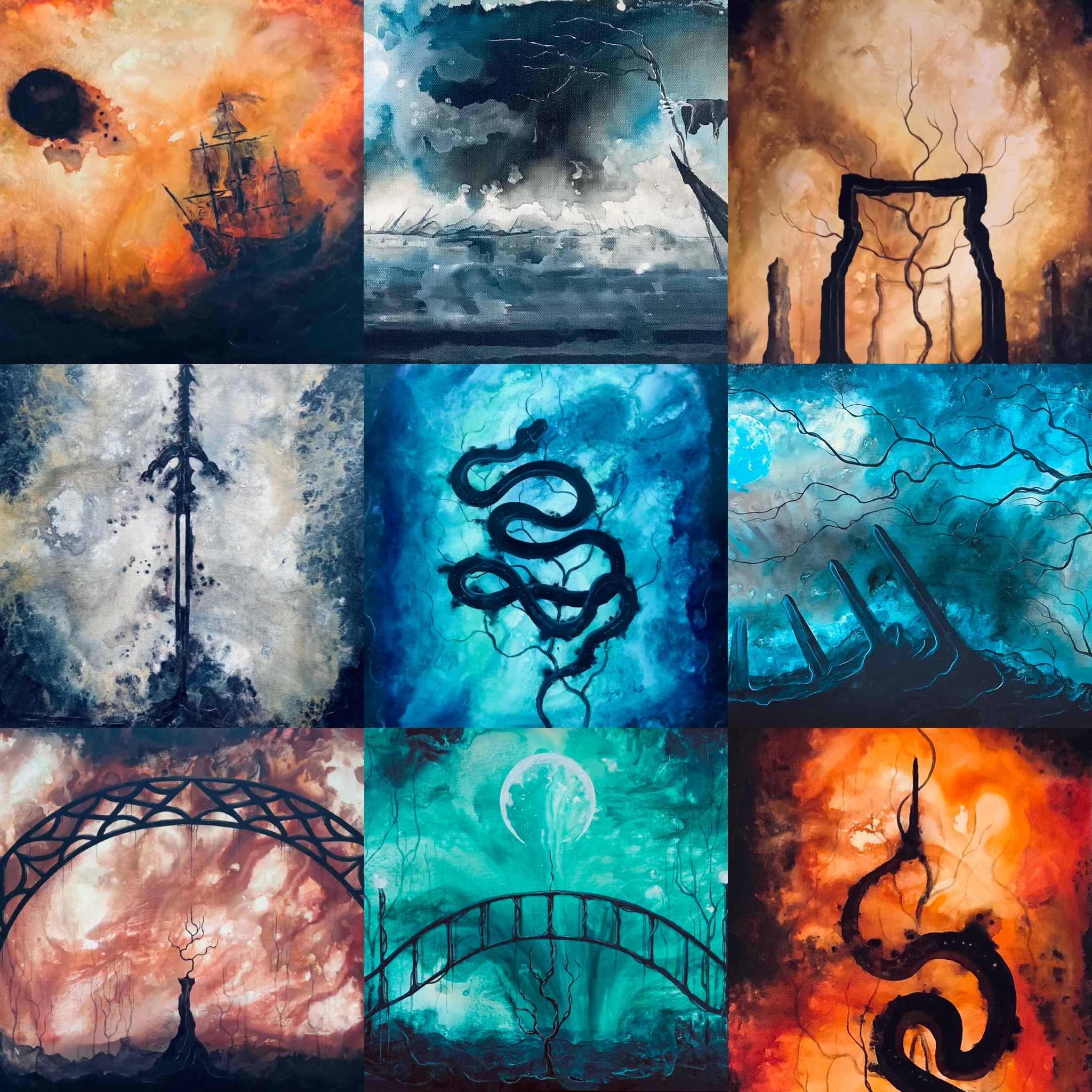
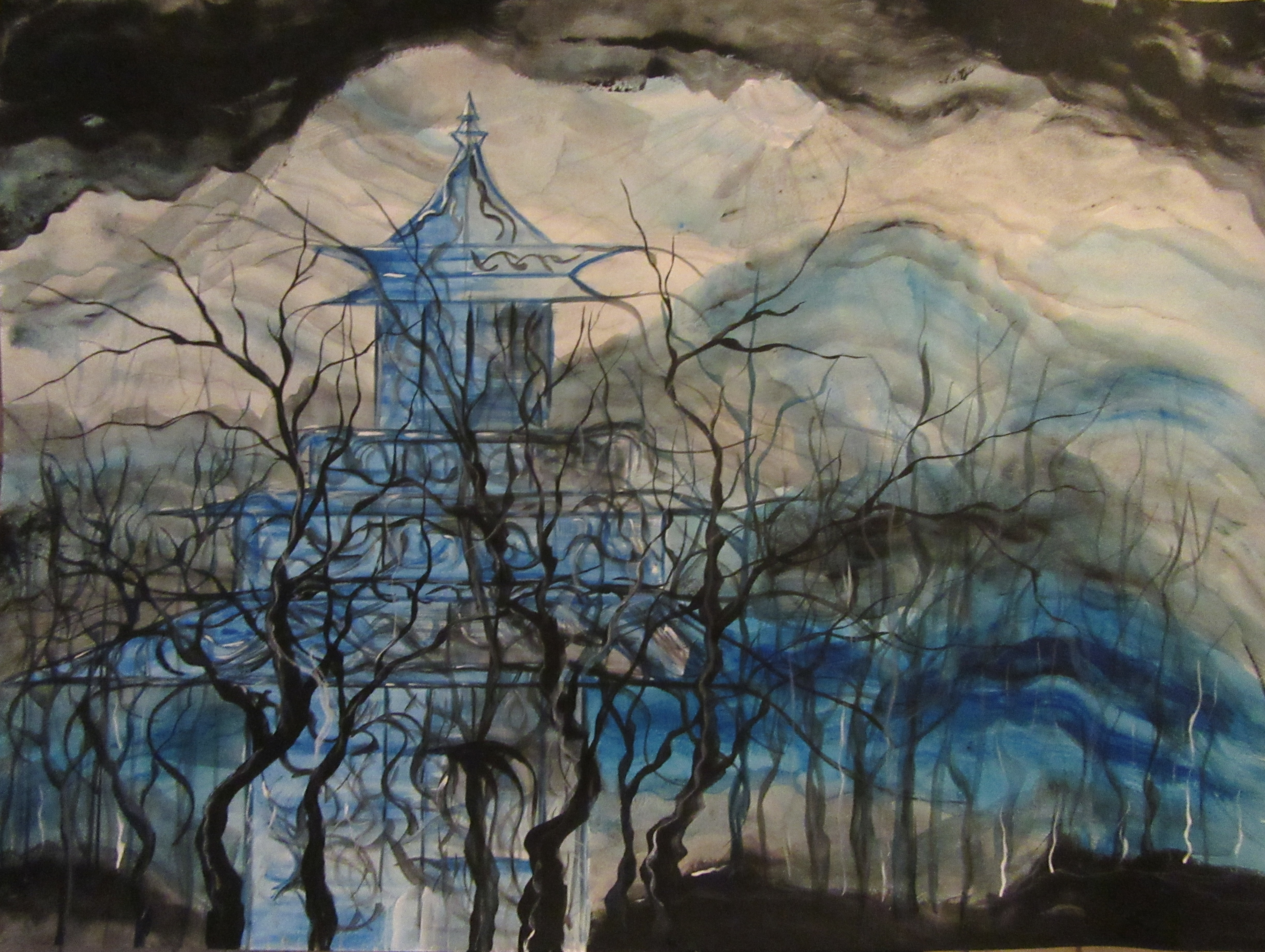
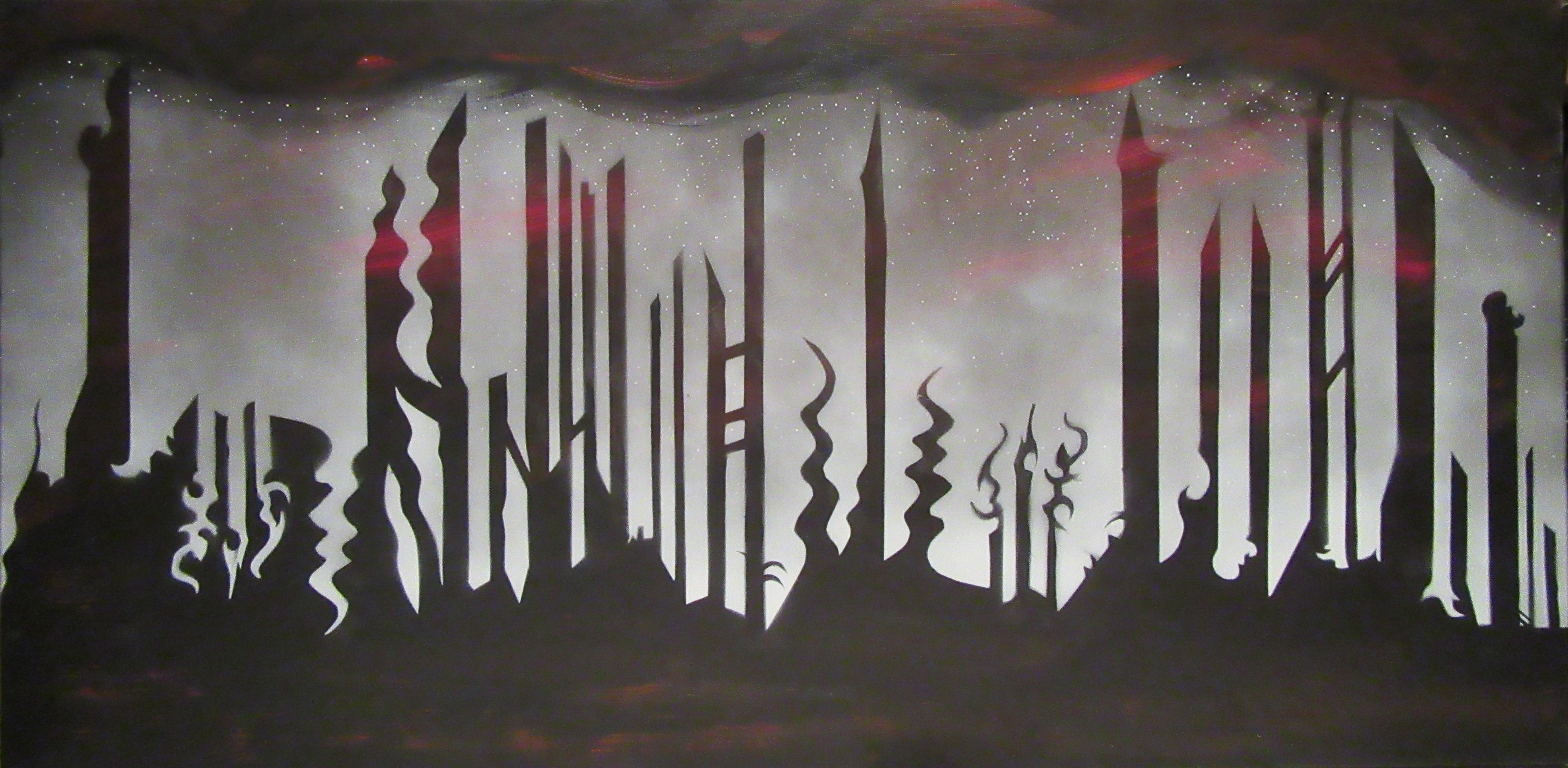
Dark cities, twisted terrains, and this time around, an eerie, abstract tree.

I call this one, ‘The Last Autumn.’  The original is for sale here, if you’re interested.

Now let’s talk about how The Last Autumn came to be:

Last Autumn 1

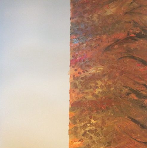
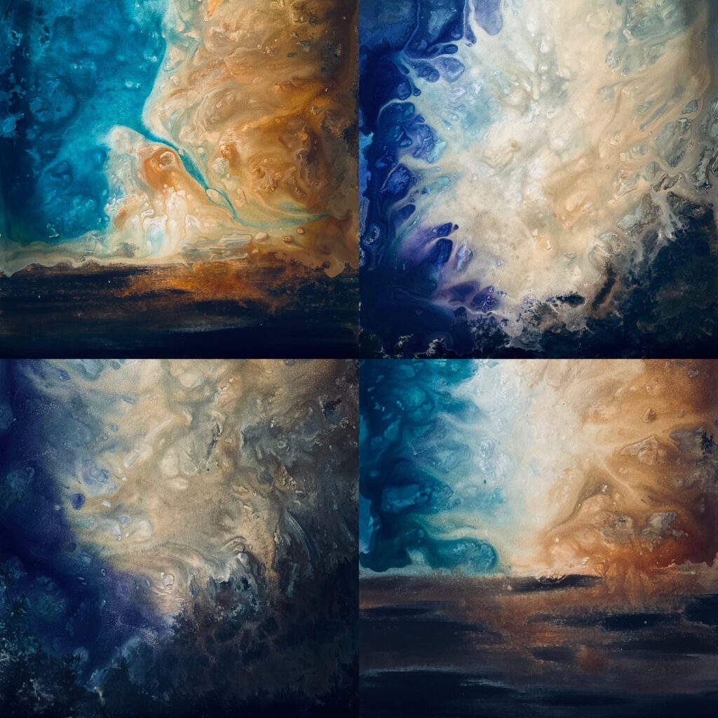
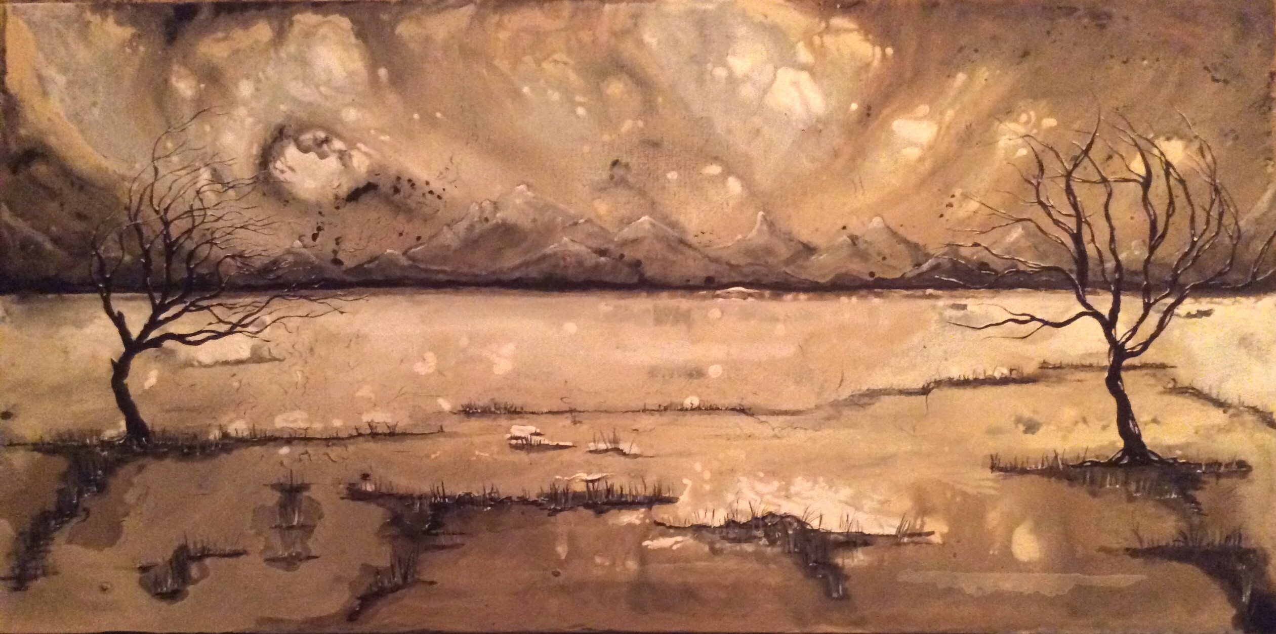
It all started with a 24″x 24″ super-thick white canvas. I used a straightedge, a level, and a twenty-year old pencil (yes, really) to divide the canvas into perfect halves. With my little wooden palette, I paired up acrylic golds, blacks, reds, yellows, and whites. I mixed them at random, and when I was done with the first coat, I poked golden dots all over the right side of the canvas. Voila. What you see above.

Last Autumn 2

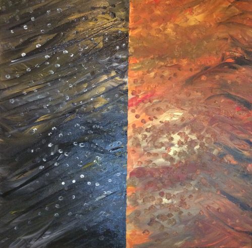
For the left side, life got a little easier. I mixed gold, black, and umber, and went nuts with fast, broad strokes. Before it dried, I poked little white ‘leaves’ into the background. The difference between the two halves was stark. I loved what I was seeing.

Last Autumn 3

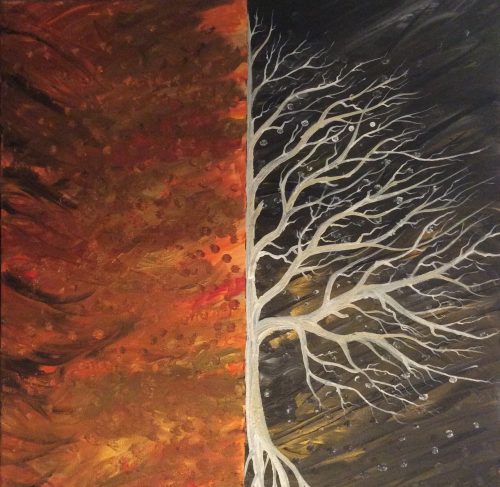
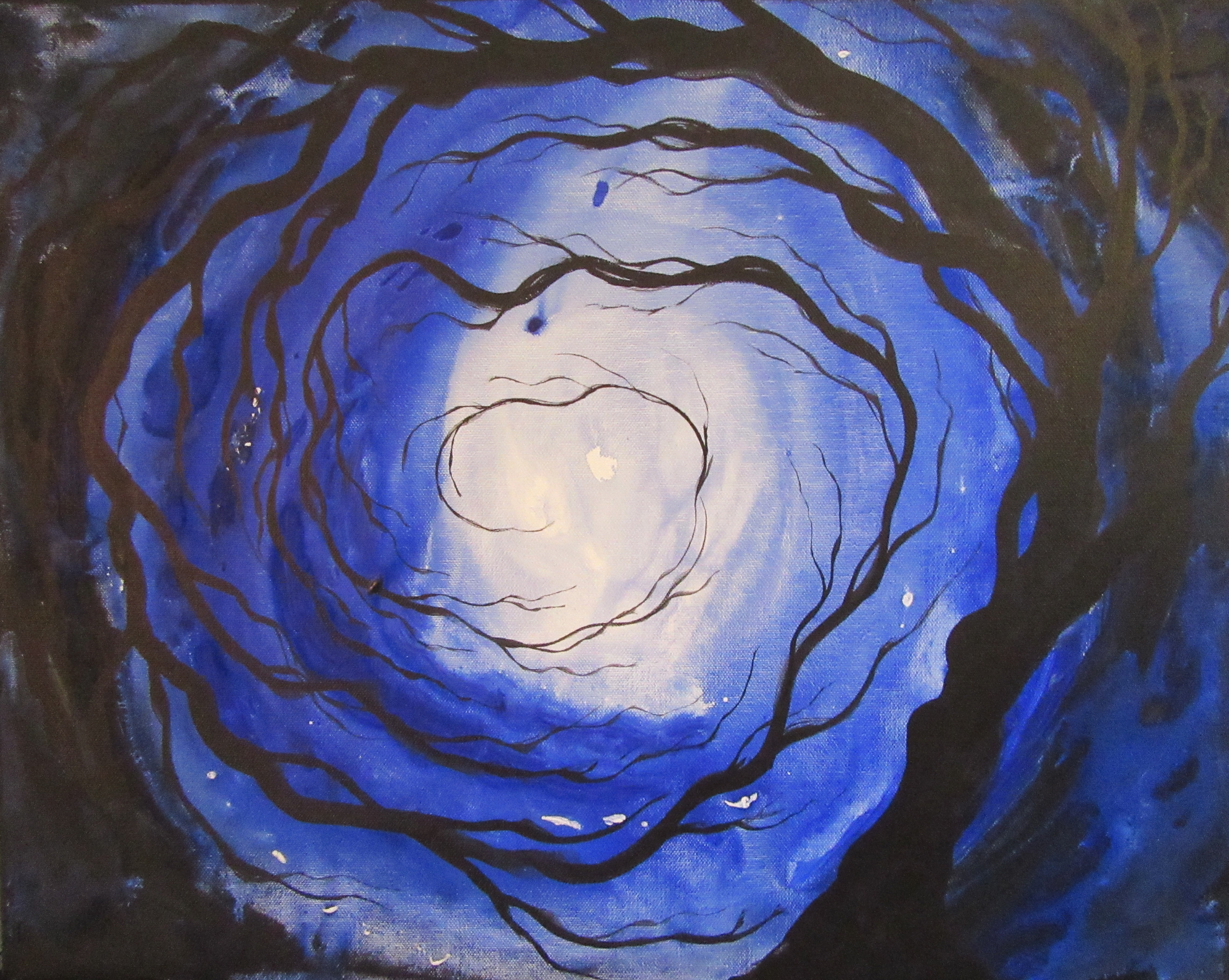
About 0.0003 seconds before starting with the right-side tree, I had a revelation. A. I wanted to flip the painting over so the darker half would be on the right and the red/gold half on the left. I have no idea why. It just felt right. B. I pulled out a sand-based gel with which to paint the tree. For those not familiar, the gel adds a texture you can see and feel when you’re up close to the painting. It’s so ridiculously fun to paint with; I suggest everyone try it.

Last Autumn 4

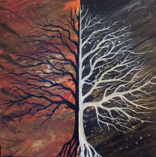
For the left side of the painting, I mixed pure black with more sand gel. I used four different brushes, starting big and working down to the tiniest branches using pretty much the smallest acrylic brush you can buy. It was tedious, but I loved it. Each flick of my wrist gave life to a new branch. The picture here is pre-varnishing; the sand gel takes forever to dry. The plan for this painting is to use a heavy gloss, which will make the colors pop and allow The Last Autumn to be a centerpiece for any room.

* * *

Thanks for reading!!

For previous Painting with Darkness entries: Part I, II, III, IV, V, VIVIII, IX.

To buy The Last Autumn, go here.

J Edward Neill

Author of Matrix-like A Door Never Dreamed Of.

And creator of the Coffee Table Philosophy series.