Hi there, art lovers.
Over the last few years, I’ve fielded a ton of great questions from artists, collectors, and generally curious folk. The conversations have been awesome and engaging, and I’m truly grateful to take part in any conversation about my art…or really anyone’s art, at all.
But…
There is one question I’ve long struggled to answer.
Just one…
“How do you create your backgrounds?”
So…yeah. It’s a solid question, and it’s something I’ve not done a terrific job of answering. Until now, my answers have usually been, “It’s complicated,” or, “I’ll get around to making a process video someday,” or something entirely too brief, such as, “I use wet brushes. Lots and lots of wet brushes.”
Yep.
It’s likely, after all these years, people are beginning to suspect I’m hiding some big, dark secret. Or that I don’t want to share some proprietary artistic discovery. Or maybe that I’m just a jerkface who avoids direct questions.
Nope.
None of those. I hope.
About a month ago, I decided to try something to answer this question once and for all. “Okay,” I told myself. “I’m going to make a time-lapse video. It’s time to show the process. A video will tell the whole story.”
I started the video. And after much cursing, several awkward angles, and the worst lighting setup ever, I fell prey to frustration and gave it up. Between you and me…it was a total fail. My camera setup was weak, my video skills frail, and my process…well…it’s even more of a beast than I already knew it to be.
So…
Here’s what I’ve decided.
I’m going to do my best to describe, step-by-step, how I create the swirly, surreal, and often strange backgrounds featured in most of my artwork.
Swirls, whirls, and surreal madness…
*
Okay then.
Let’s jump right in.
Step one, and it’s very important, is to start with a high-quality canvas stretched on sturdy wooden-panels. I typically get mine from Blick Art’s premium canvas collection, but I’ve also scoured Michael’s and a handful of local art supply stores, including JoAnn’s. Now, there are several keys to a canvas being ‘high-quality.’ No nicks or scuffs in the canvas. No flimsy panels. But the number one most important quality for this particular process is that the canvasses are flat. As in, very flat. No warping. No bends in the wood. No dips or loose, flappy canvas stretches.
Flat. Flat. Flat.
Why? We’ll get to that later.
Step two. Acrylic paint. Lots and lots of acrylic paint. Especially white, black, unbleached titanium, and Payne’s grey. These are your most important weapons. I use Liquitex Basics, never the heavy-bodied stuff. You can use any brand you want, but whatever you do, don’t use different brands of paint while working on the same painting. The varied consistencies will cause awkward color blends, and the varied dry times will wreck your process.
Step three. A big, flat table. The flatter, the better. For your first several (or several hundred, in my experience) attempts, you’ll probably make a mess. So maybe choose a table you like, but don’t love. I use two different tables. A heavy Home Depot workbench and…perhaps surprisingly…the granite countertop in my kitchen.
Step four. Brushes. For these kinds of backgrounds, you’re going to need several sizes of brushes. Big (1″ wide) trim brushes. Fat-bottomed brushes that can hold a bit of water. Slim, knife-like brushes for detail work. Itty bitty pointy brushes for blending in tight spots. For background work, I don’t use anything fancy. Save your best brushes for the post-background subject work. Just buy a ton and keep extras on hand (I mostly use these.)
Step five. A jar (or jars) for holding water. As you likely know, acrylics dry fast. And your biggest enemy in this process will be time. You need to keep your brushes mildly wet (but not soaking) at all times. If the paint dries, the artist cries.
So…
You’ve got a canvas, a flat space to work, brushes, acrylic paints, and water.
Now it’s time to work.
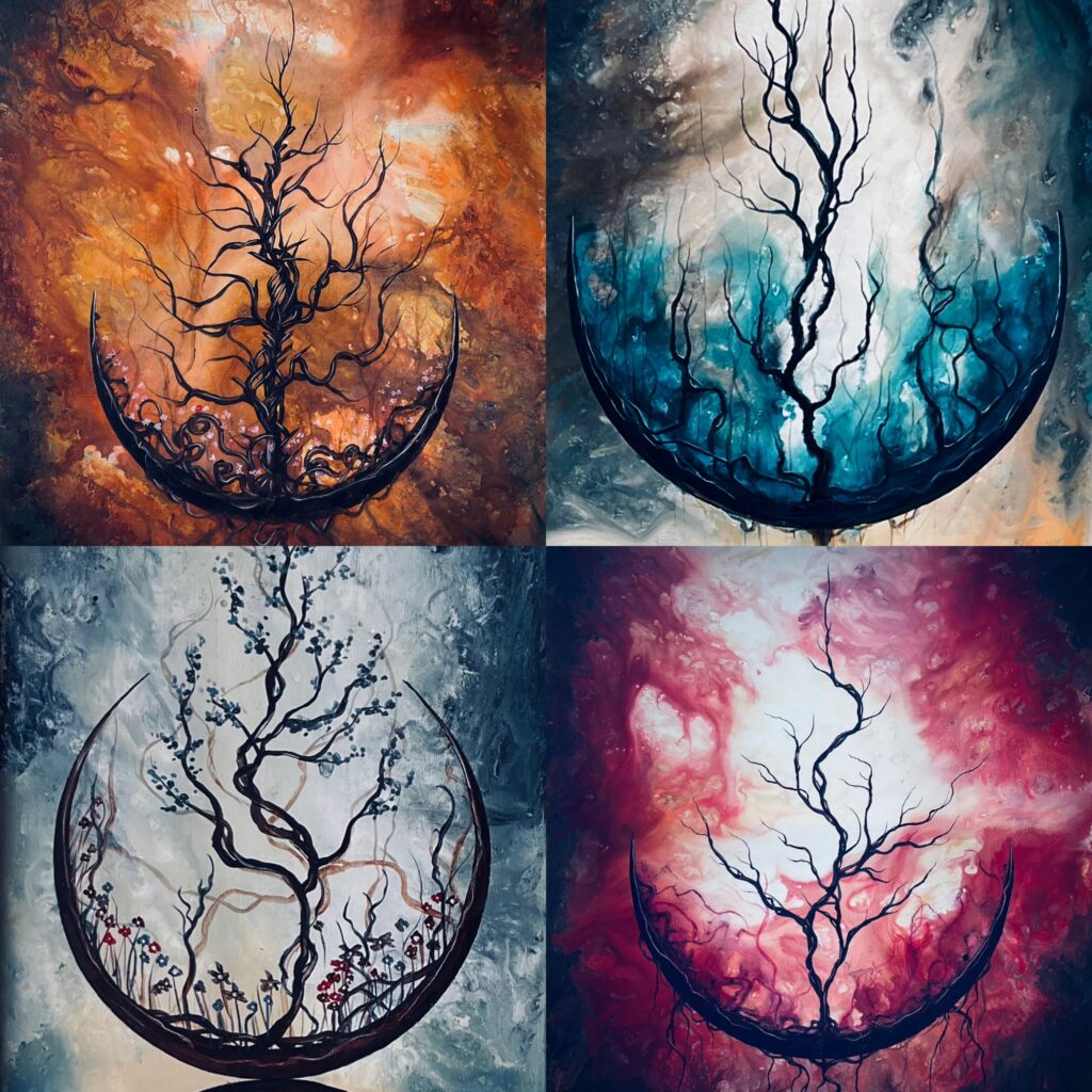
Step six is key. This is the underpainting, the core of your color base, the background to the background. With a un-wetted brush, using un-watered acrylics, apply your various acrylic colors to the canvas in a single not-too-thick layer. Use whites and unbleached titanium in the areas of your painting which will be light, and darker tones in areas of shadow. Between these, you’ll use the actual non-neutral colors you want your painting to contain.
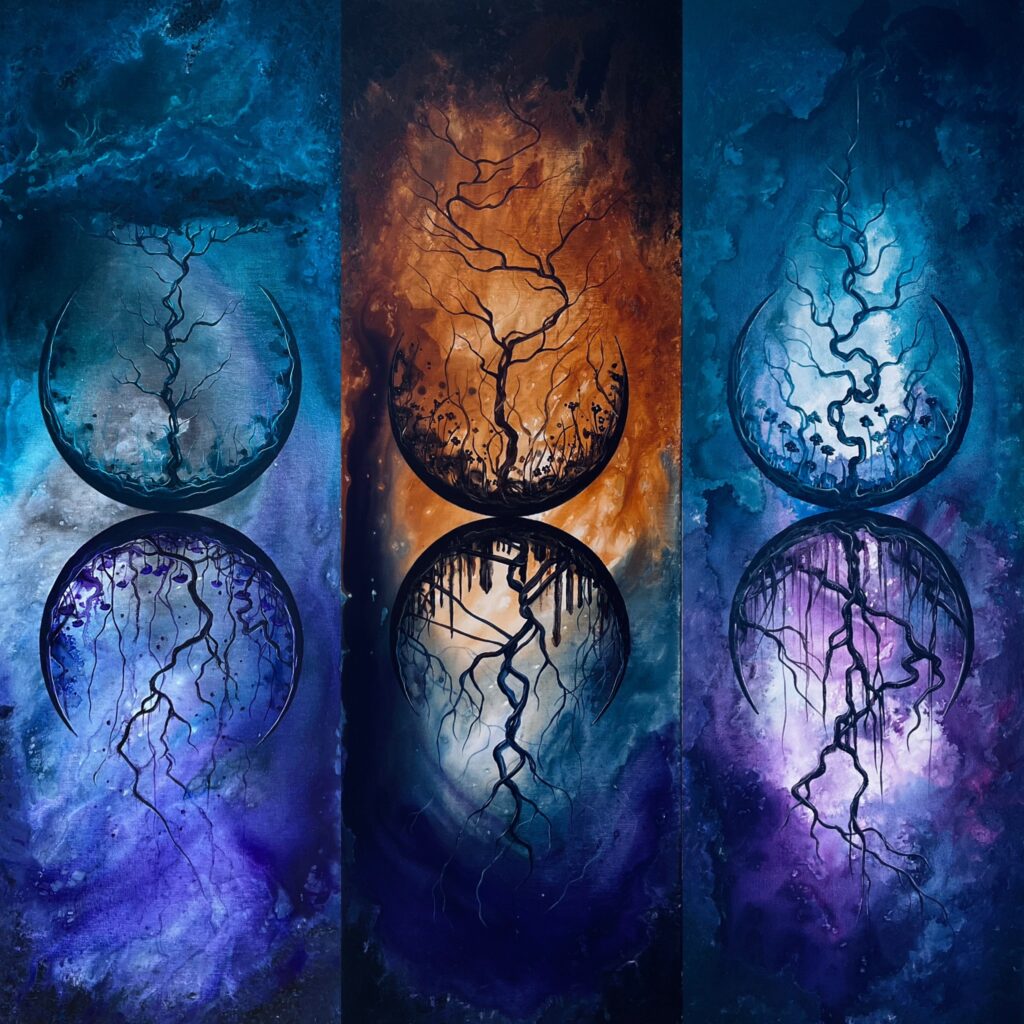
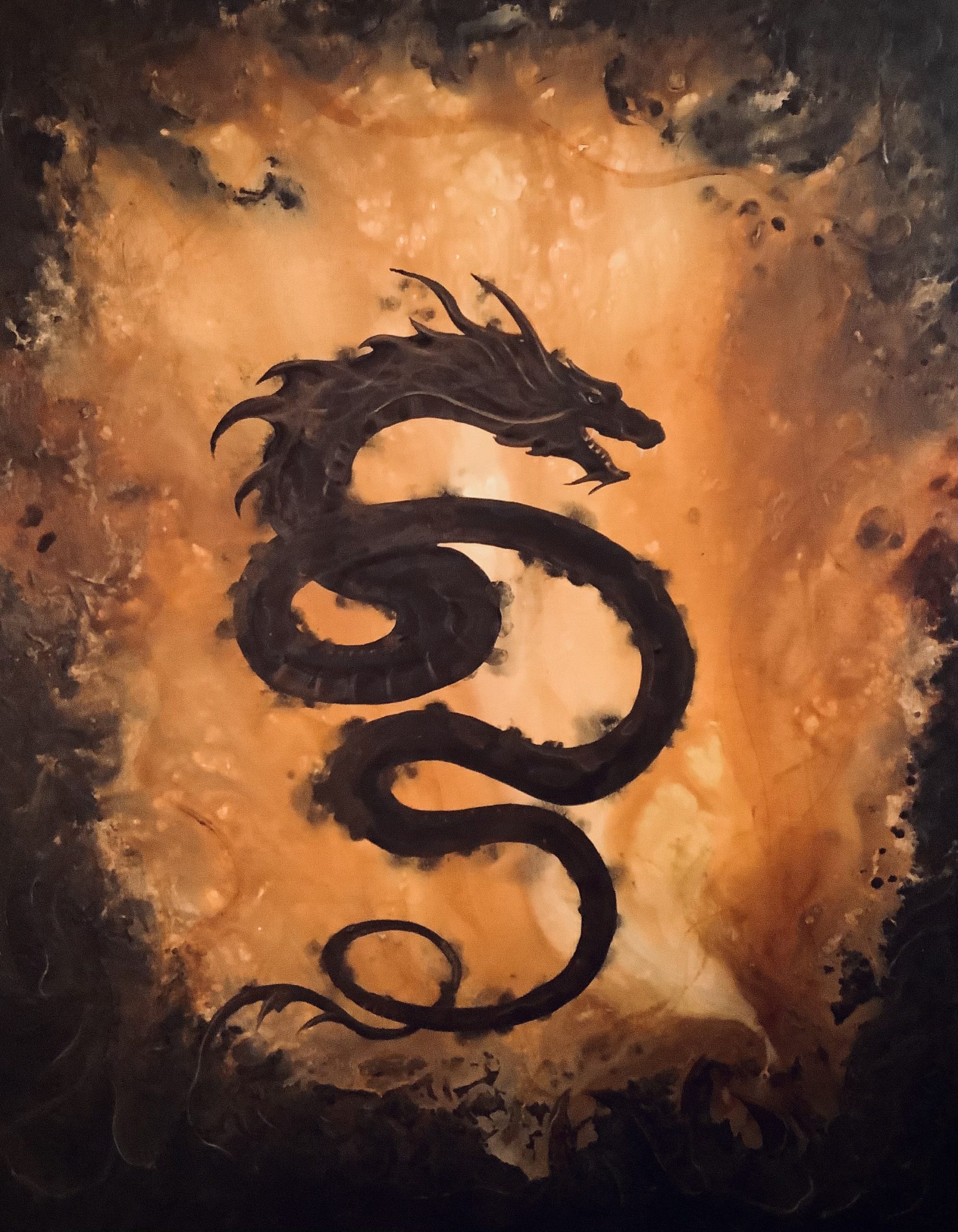
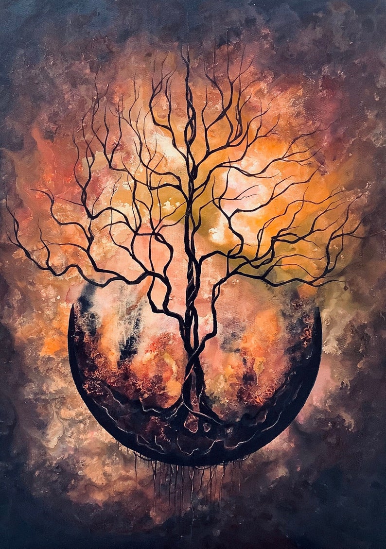
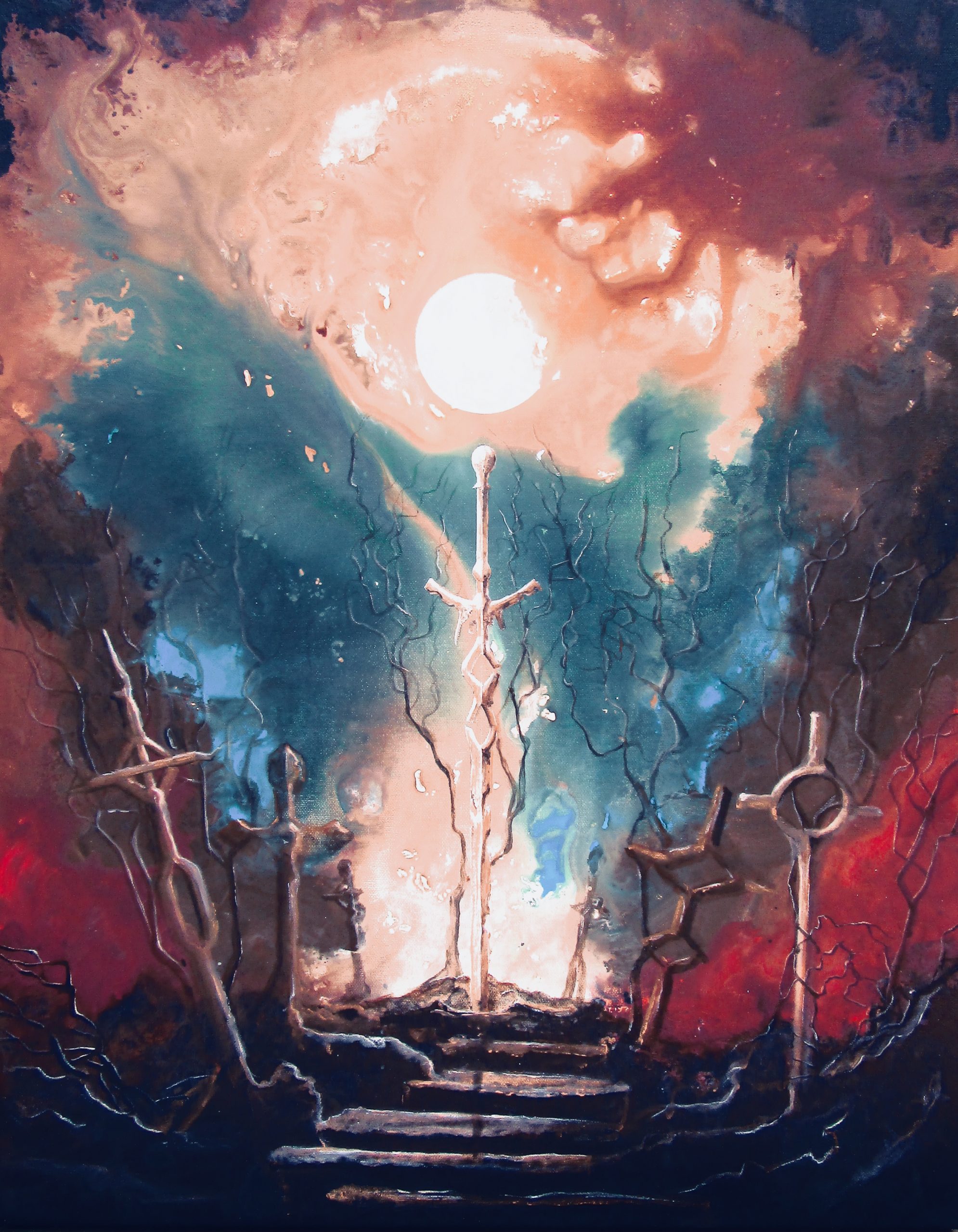
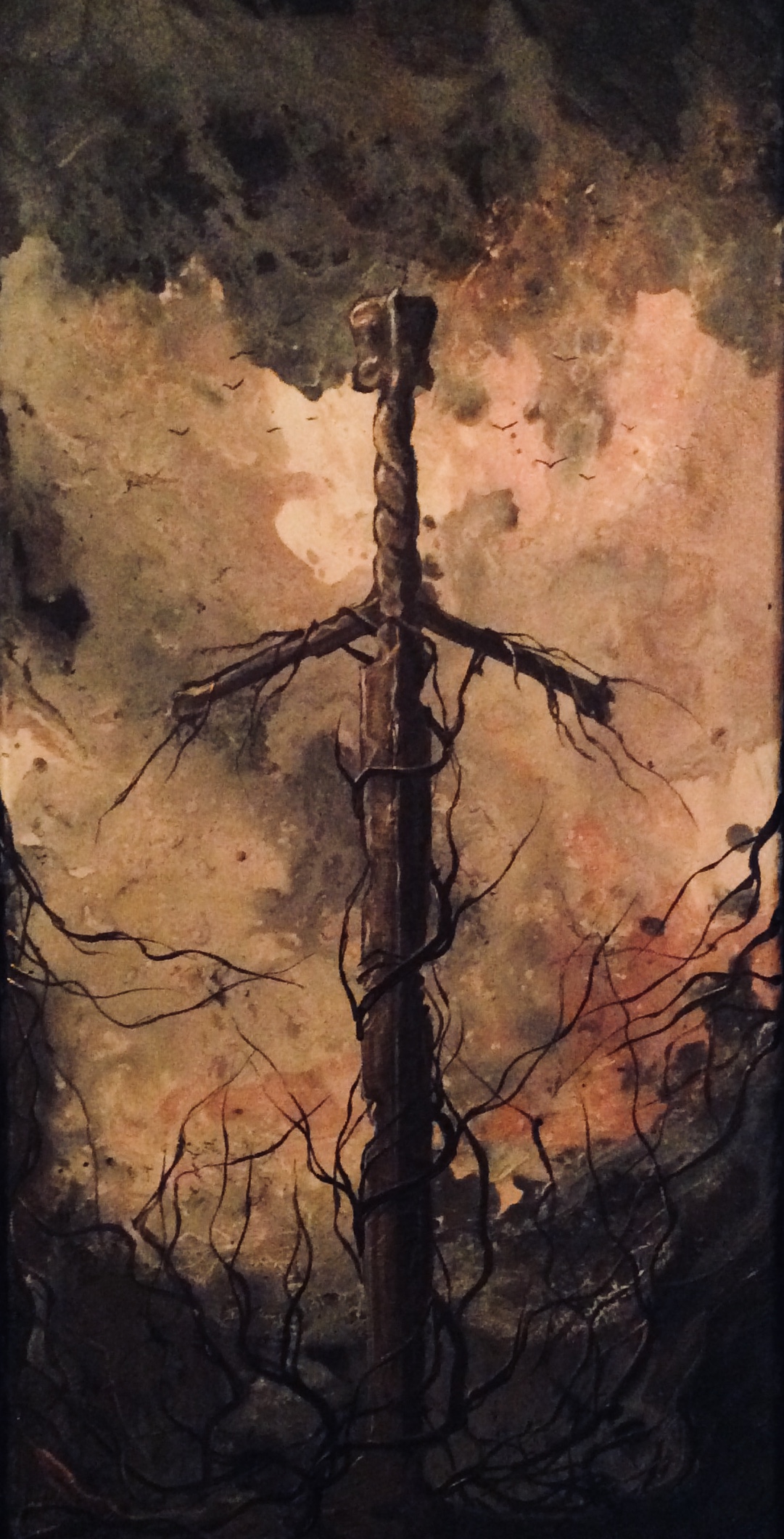
Here’s an example. This is my painting ‘Born of Fire,’ in which I used about ten difference color hues to create the background. Ignore the tree and moon on this piece. Focus on the general layout of the background colors beneath.
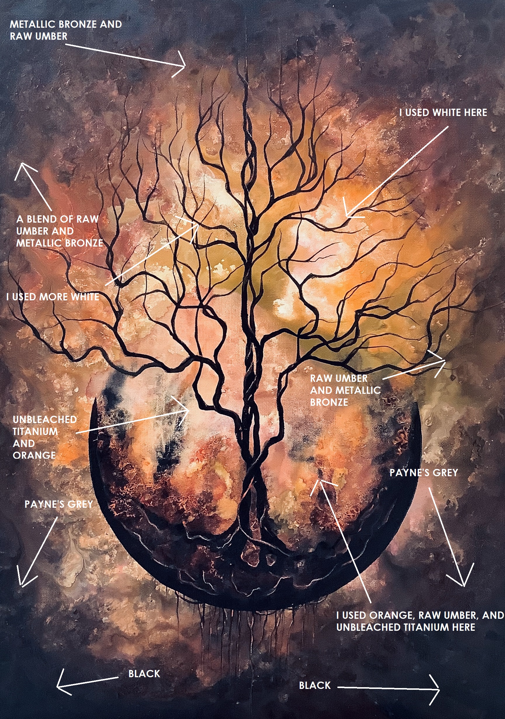
What you want to do is apply the colors in roughly (it doesn’t need to be precise) the areas in which they’ll appear in the finished background. It’s just an underpainting at this stage. Precision isn’t as important as general location.
Step seven. Wait for the underpainting to dry completely. One or two hours should be enough. If you’re in a rush, run a fan nearby to whisk fresh air across the canvas surface. In any case, do not begin the next step until the underpainting is finished drying. Else you’ll get weird pops and textures you might not want. (Although, for advanced painters, you can actually time this to create the textures and pops on purpose.)
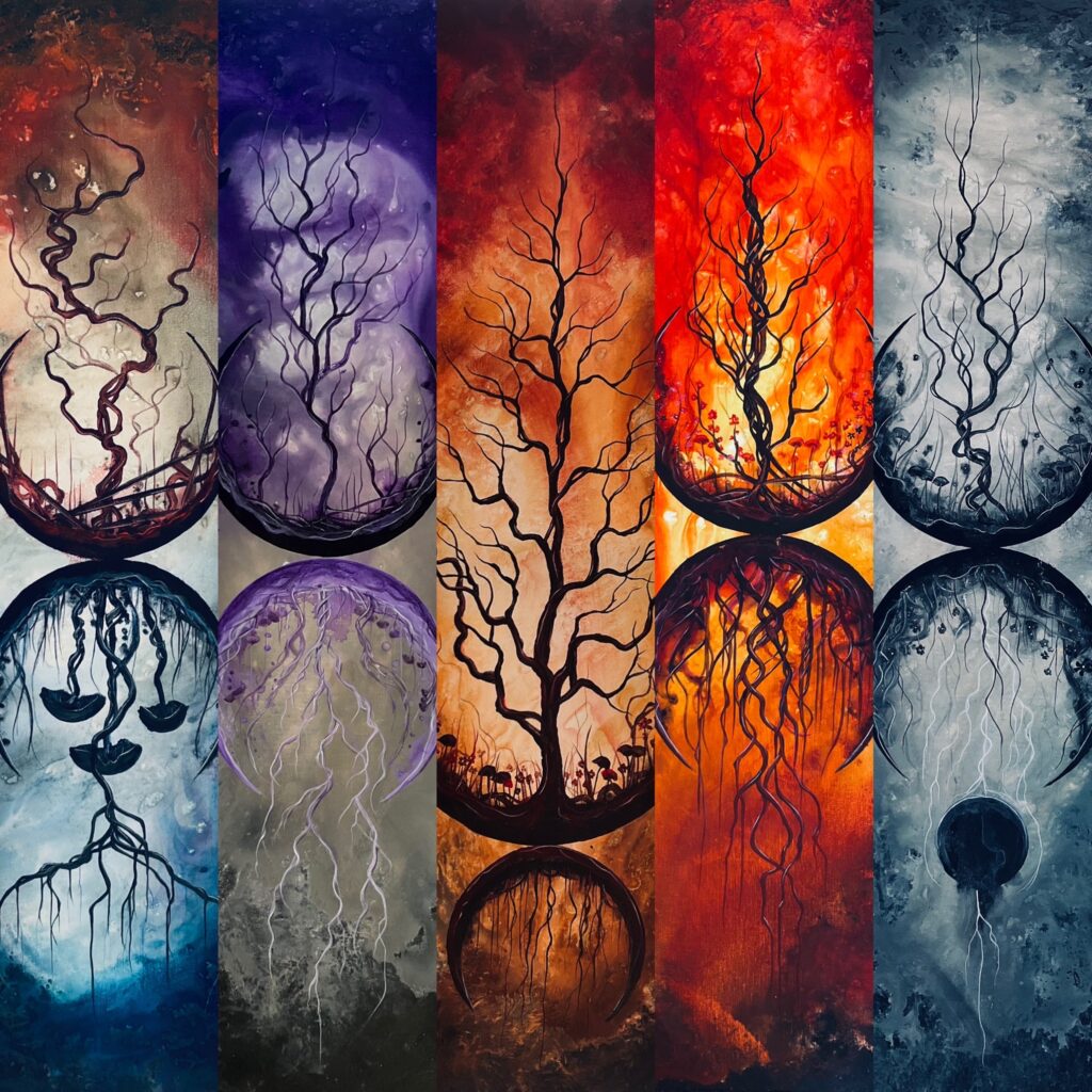
Step eight. The background. This is where the magic happens. You’ll need your brushes, your water, and patience all on hand. What you’ll want to do here sounds complex, but it’s really not. I’ll break it down in a bulleted list:
- Starting with your lightest color, and ending with your darkest, use a larger water-wetted brush (1/2″ – 3/4″ wide) to apply your colors in the precise areas you want them to appear in the background. Remember…light to dark.
- When applying each color, continue dipping your brushes into the jar of water between each brush stroke. The key: only a little bit of wetness. Too much will make the colors run wild across the canvas.
- Work quickly. While the water will slow the drying of the acrylics somewhat, it’ll still start drying after about 15-20 minutes.
- In any area where two or more colors meet, use wetted knife-edge brushes to apply narrow lines of water. The colors will begin to blend. The smaller the brush you use, the more control you’ll have. If you want your colors to be a bit unpredictable (which is just fine, by the way!) use larger brushes with a bit more water. More water will make the colors run wild.
- If you want to smooth out brush strokes or make them disappear altogether, pat down the area using the flat side of a mildly wet brush. Or…for a cool stippled effect, very lightly pat the area with a dry paper tower.
- Third reminder: Always work light to dark. If you jump back from a dark area to a light area using the same brush, you’ll lose the explosive lighting effect.
- The reason using a flat surface and a flat canvas is key? If your workspace and canvas aren’t flat, your colors will tend to run downhill…literally. Colors you didn’t intend to combine will tend to mix, and murky patches could form. Flat, flat, flat!
Step nine. Now your painting, plenty damp and crazy looking, will begin to dry. But your work continues. You’ll need to babysit your painting at this stage, using smaller, mildly wet brushes to carefully blend areas of color you may have missed the first time. Also, sometimes tiny pool of water will form, which can tend to make patches of your background look murky. In these cases, use the corner of a paper towel to gently soak up any excess water. Or…carefully use smaller brushes to manipulate the wet paint for a better color-blend.
Step nine is usually the most challenging part of this process. Depending on the size of the painting, you may need to hover over your painting for ten minutes…or several hours, correcting murky patches, refining color blends, and building up your background to look exactly how you want. Patience is key here. Attentiveness to detail can make all the difference between creating a swirly, colorful landscape…or a murky, too-wet swamp.
Step ten…only if needed. Often, with larger backgrounds, doing step nine just once isn’t enough. Acrylics can be cranky, and sometimes, even with underpainting and a full second layer of paint on top of the underpainting, pale patches can emerge. In this case, what I do is wait for the canvas to completely dry…and complete step nine again. Sounds tedious, right? But in truth, adding another layer can result in a truly deep, vibrantly colorful background. Powerful colors are your friend, and often the best way to achieve it is in layers.
* * *
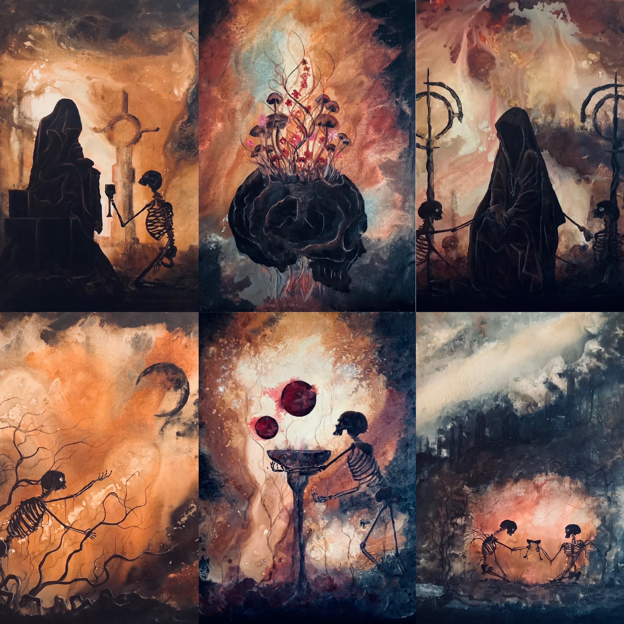
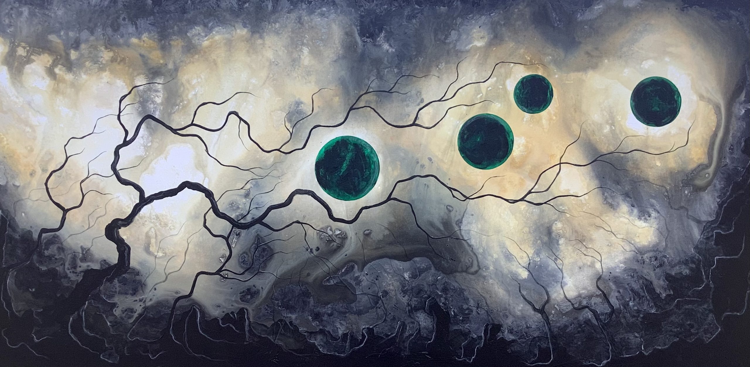
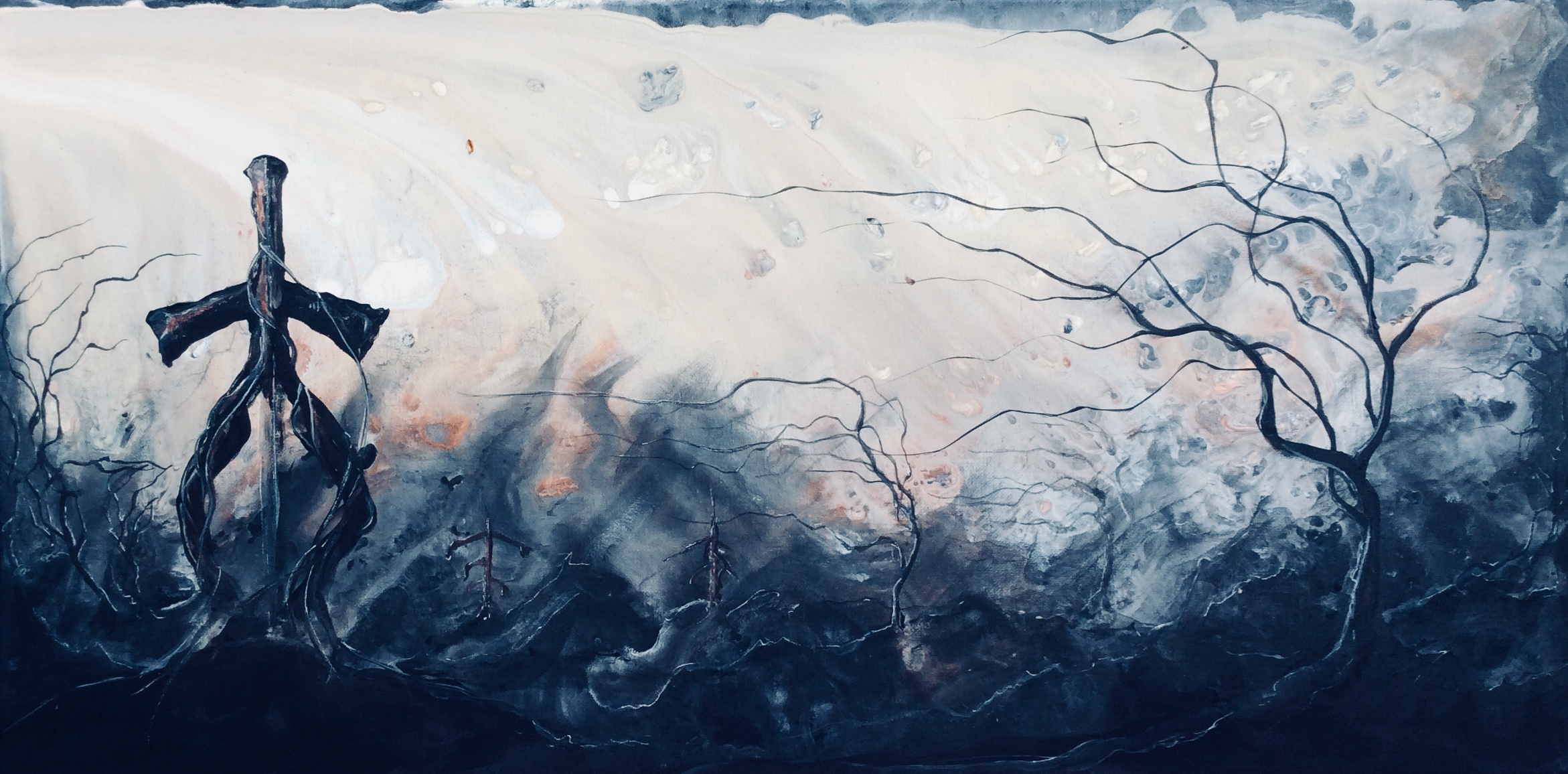
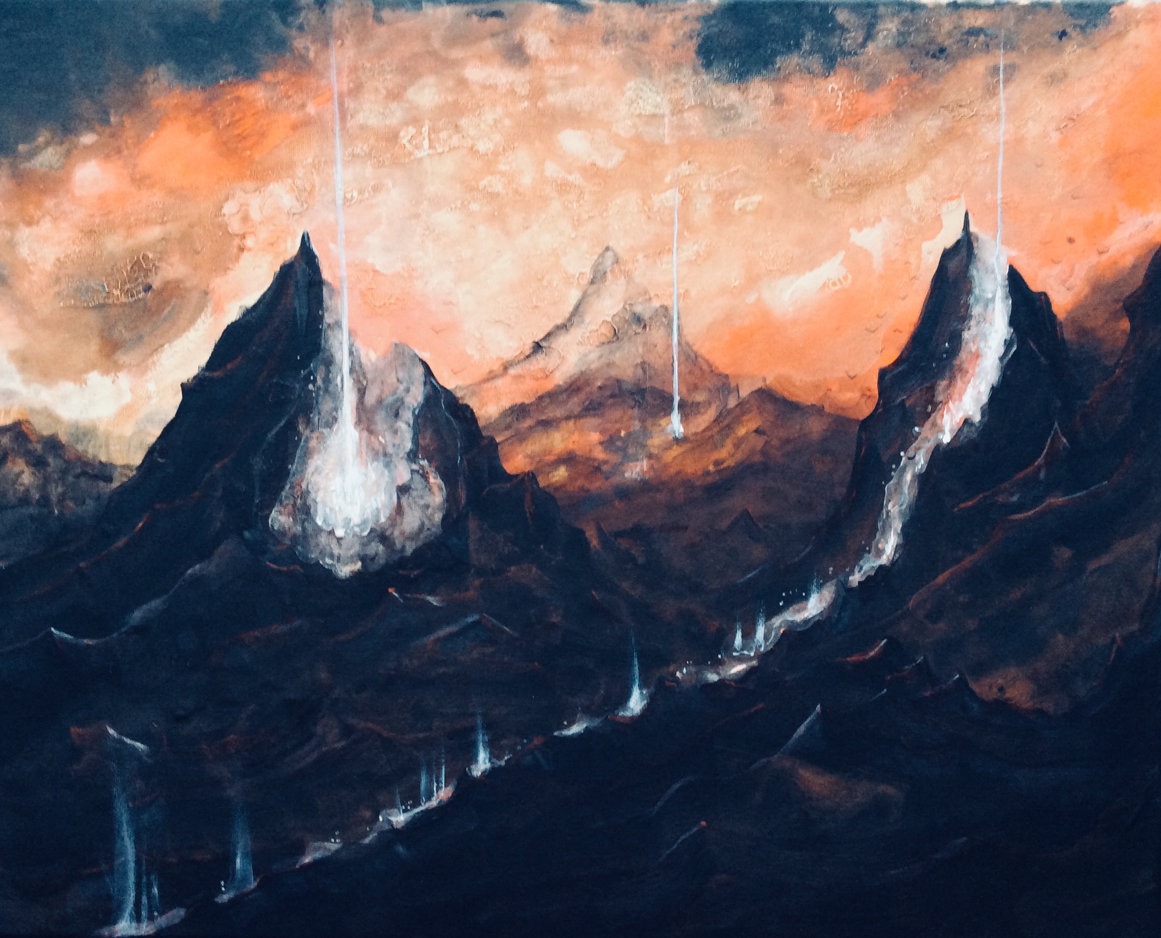
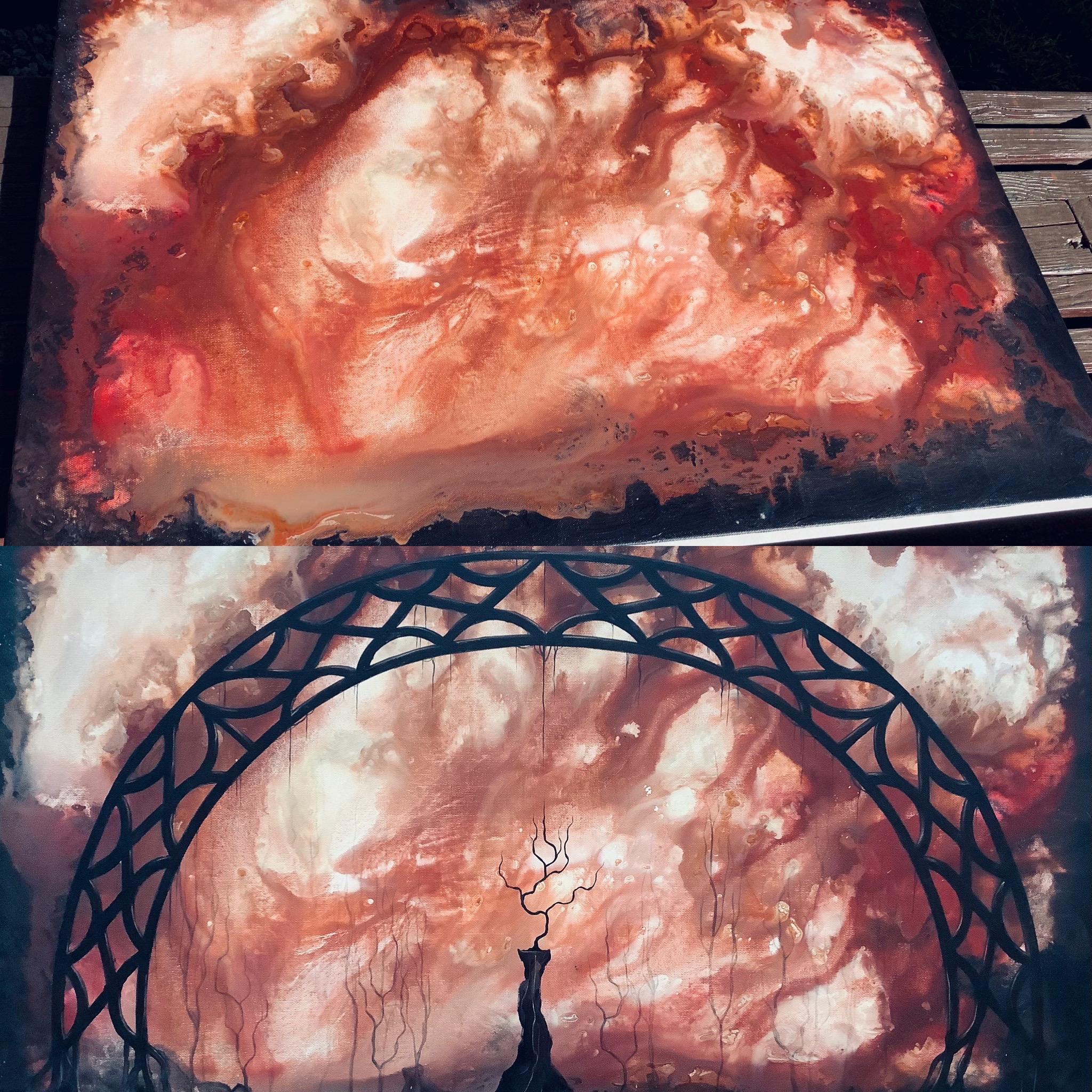
For fun, here’s three before and after photos. The first photo is after the backgrounds are applied, but before drying. The second is the completed painting with full details.

‘Let Us Be Shadow’
‘Dark Desperation’

‘Bridge of the Broken Moon’
* * *
With your background complete, your paints dried, and your brushes cleaned, you’re all ready for the fun part. Step eleven is all yours. Paint atop your background as you would any other acrylic piece, paying attention to the light and dark areas, and you’re sure to create something spectacular.
And most importantly, have fun!
*
*
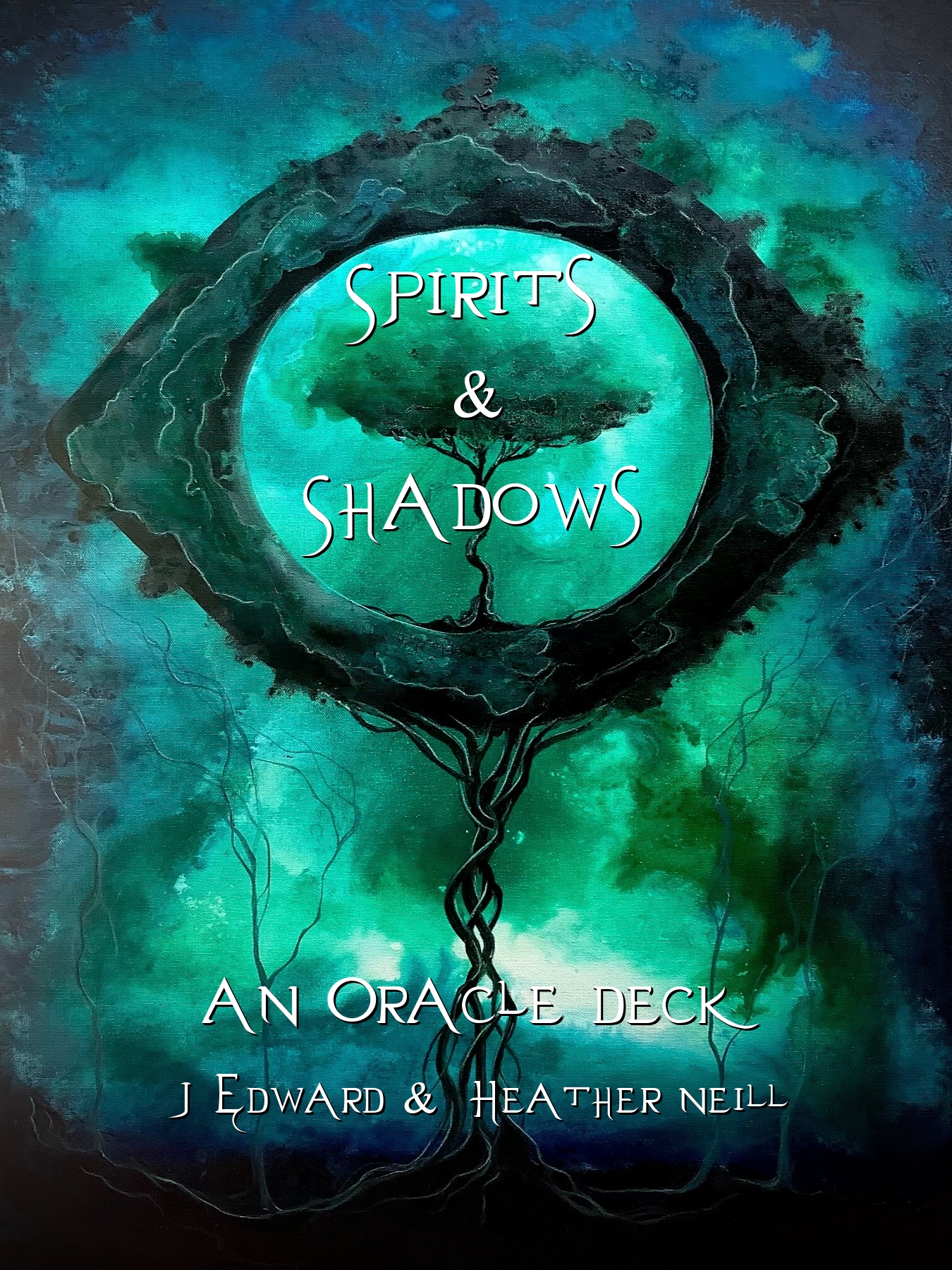
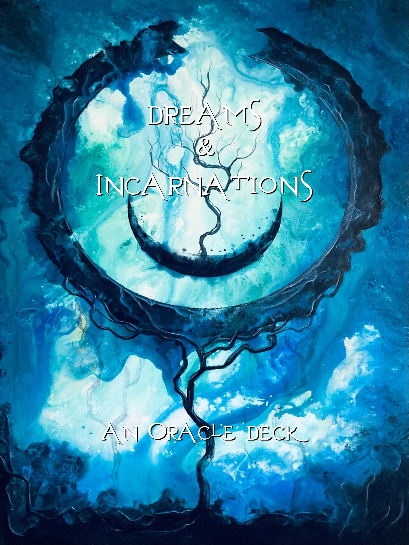
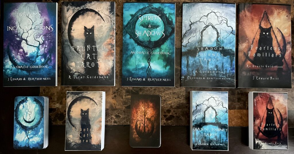
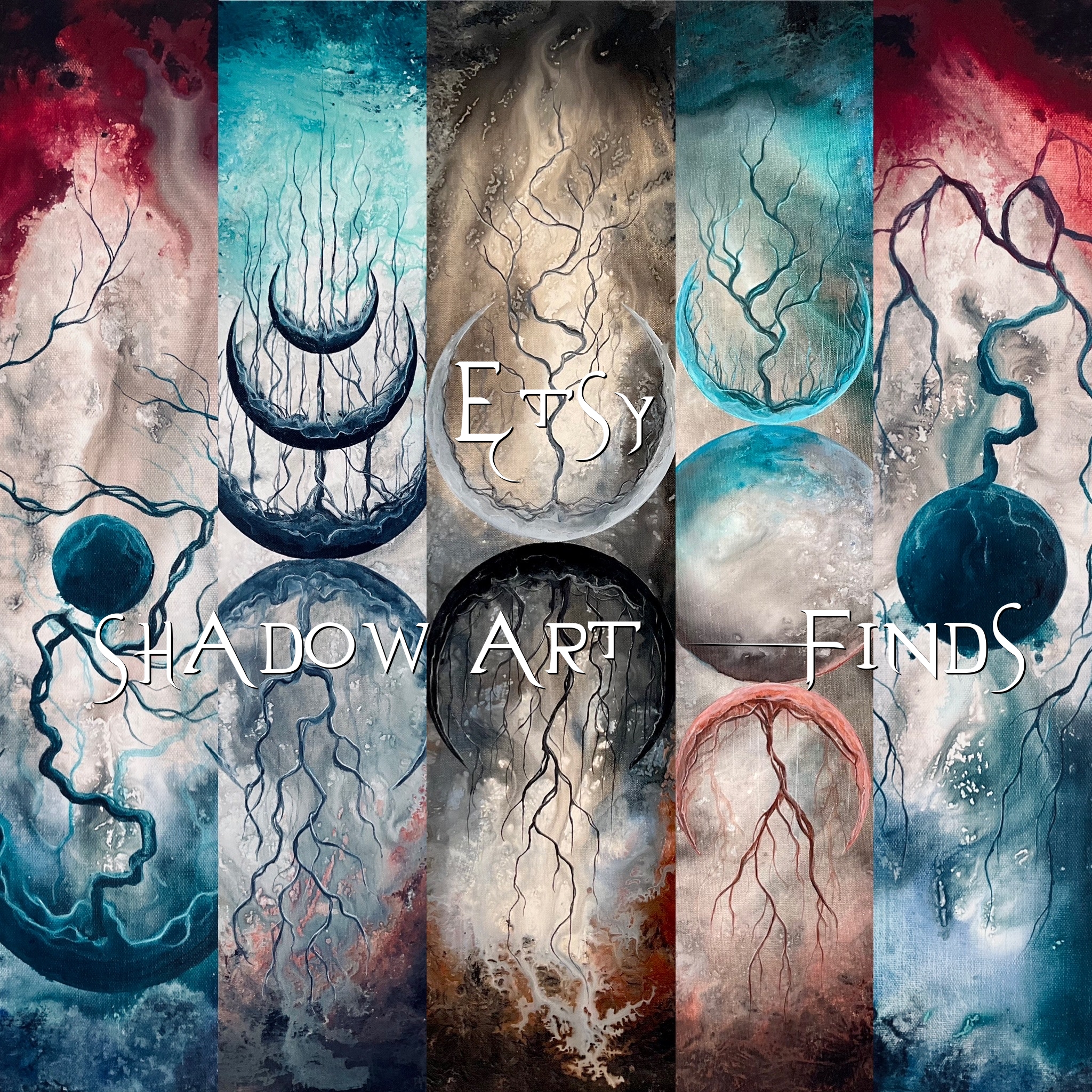
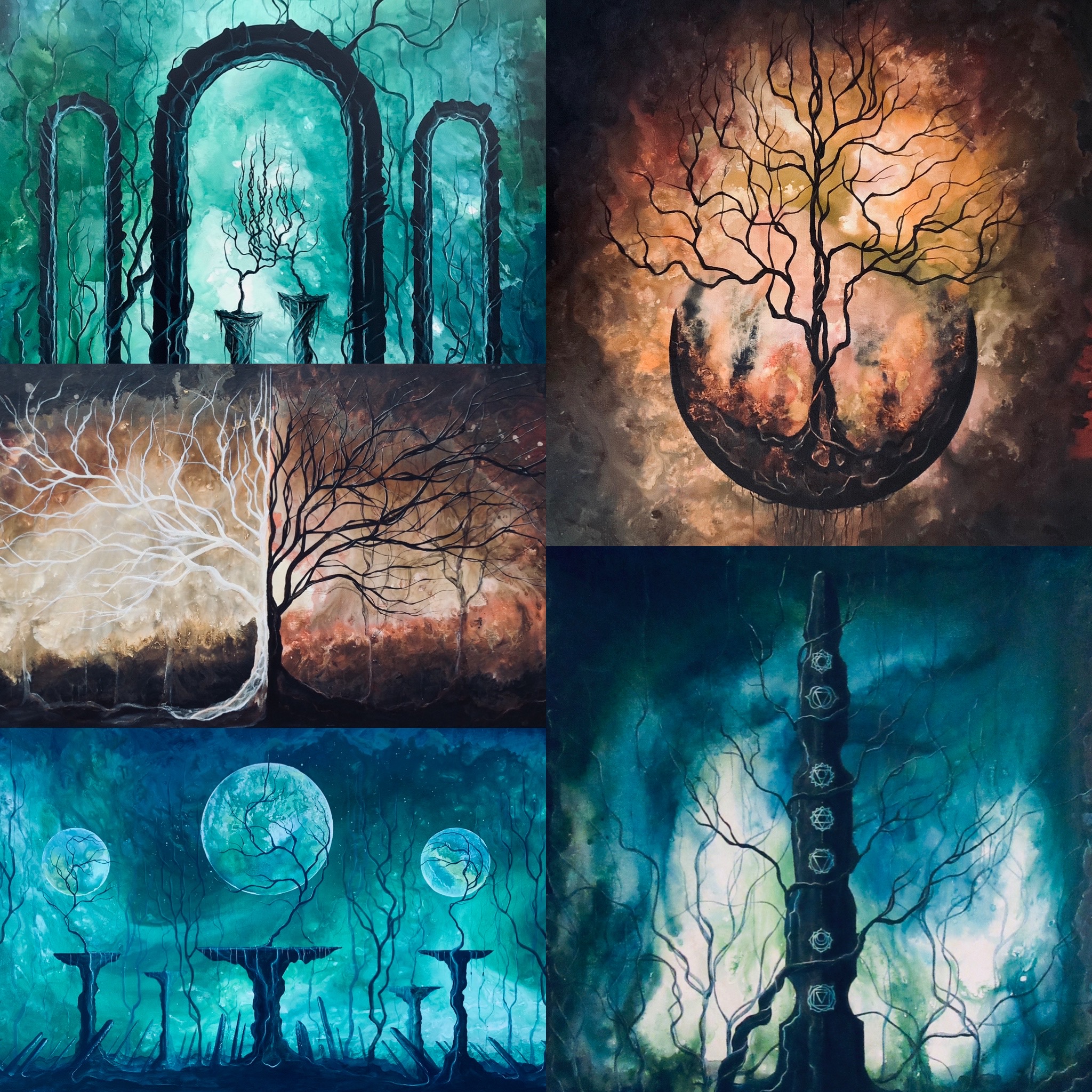
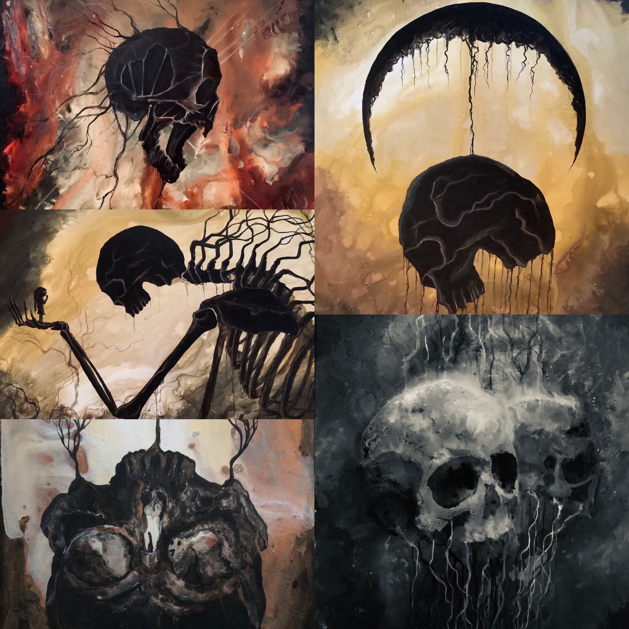
For a closer look at all my crazy backgrounds and completed works, head here.
Thanks for stopping by.
J Edward Neill